/
All
/
Identity
/
Packaging
/
Digital
Pick UP!
/identity /packaging
CLITA
/identity /packaging
Leibniz Design Relaunch
/identity /packaging
Sammontana “I Classici”
/packaging
Roncadin Extra Voglia
/packaging
Bahlsen Seasonal 2021
/packaging
Ginori LCDC Collection
/identity /packaging
Cantina Puiatti
/identity /packaging
The Perfect Pop
/identity /packaging
Bahlsen Global Relaunch
/identity /packaging
Why Run
/identity
C’è di Buono in Italia
/packaging
Gocciole Coconut
/packaging
Voiello “La Scaramantica” 2020
/packaging
Famiglia Crispino
/identity /packaging
Sammontana Gruvi
/identity /packaging
Rana Duetto
/packaging
Sammontana UAU! Bars
/packaging
Sella&Mosca Bitter
/packaging
Sir Winston Attivatè
/packaging
Voiello “La Scaramantica”
/packaging
Bellavista Alma Non Dosato
/packaging
Sammontana UAU!
/identity /packaging
Sammontana cakes
/packaging
Pedon
/identity /packaging
Mutti Limited Edition
/packaging
Calligaris
/identity
CODE by Calligaris
/identity /packaging
Fast & Fresco
/identity /packaging /digital

Auge Design Srl

Address /
Via Gino Capponi, 26
50121 Firenze – Italy

Contact /
+39 0550209446
info@auge-design.com

Follow /
LinkedIn
Behance
Instagram

  • Profile
  • Contact
  • Shop
Work
  • Work
  • Profile
  • Contact
  • Shop
next
previous
/packaging
Sammontana cakes

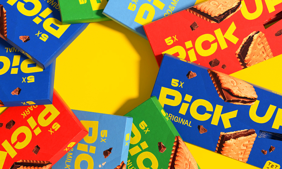
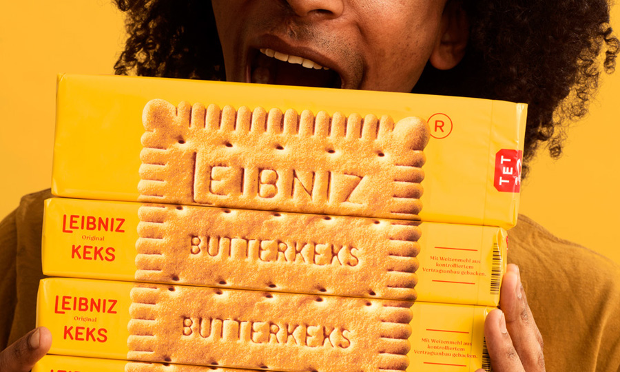
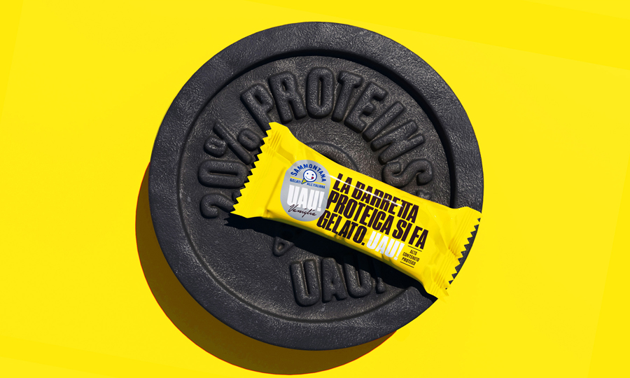
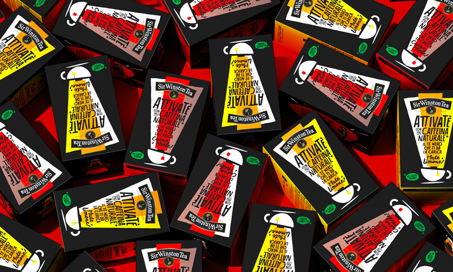
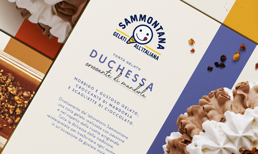
Frozen ice-cream cakes never looked so real and tasty: how we gave authenticity and modernity back to an old-looking cake packaging.

More Info
Client

With over 70 years of history in ice cream making, Sammontana is the Italians’ favorite industrial ice cream and frozen goods brand. The Group operates in 5 production sites around the country and counts over 1000 employees. Sammontana indubitably means Italian Summer.

Assignment

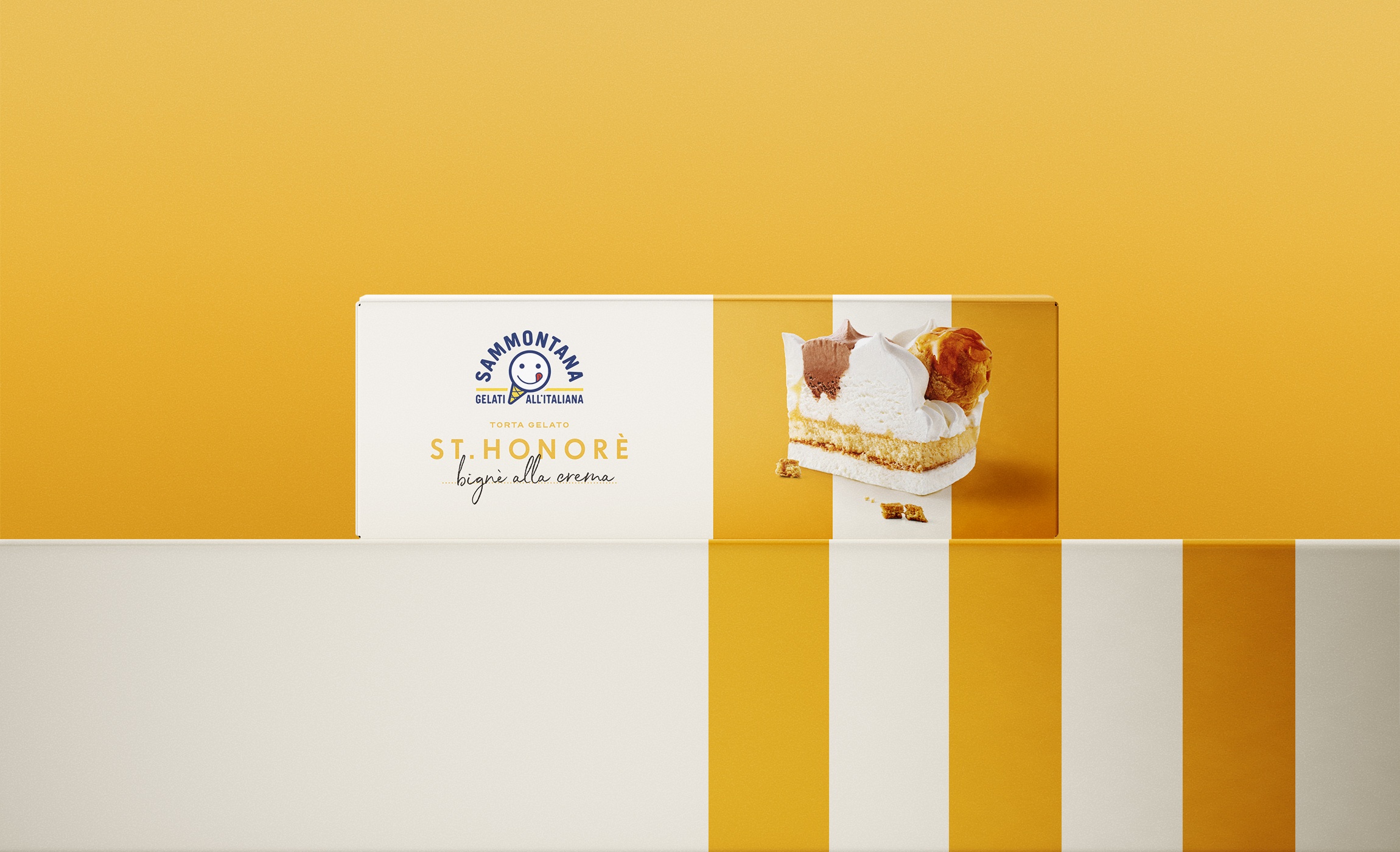
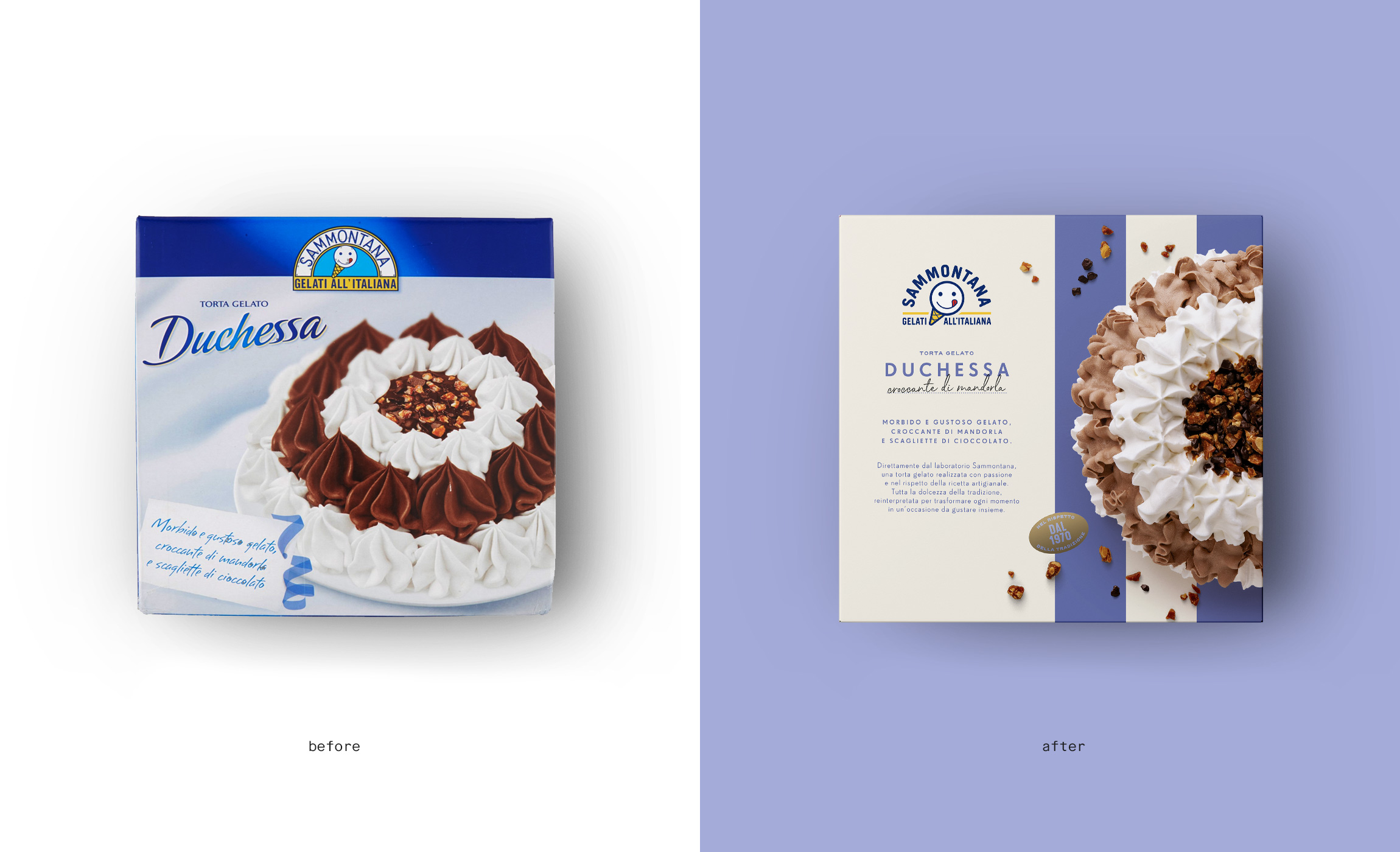
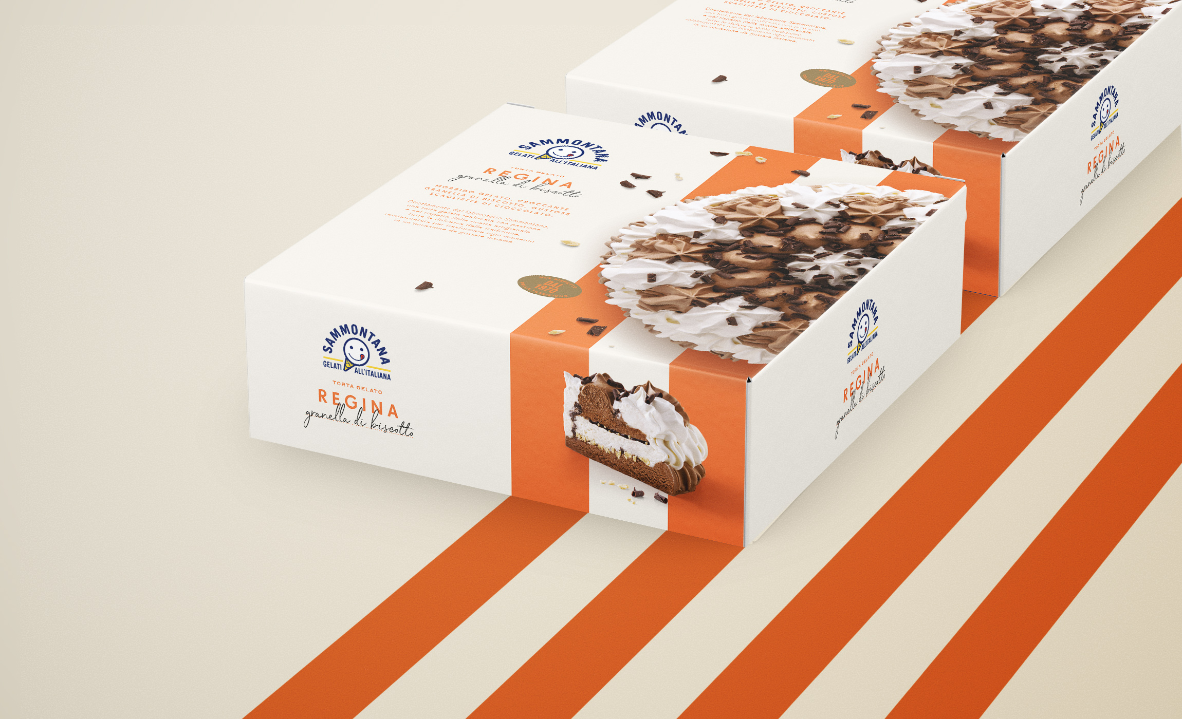
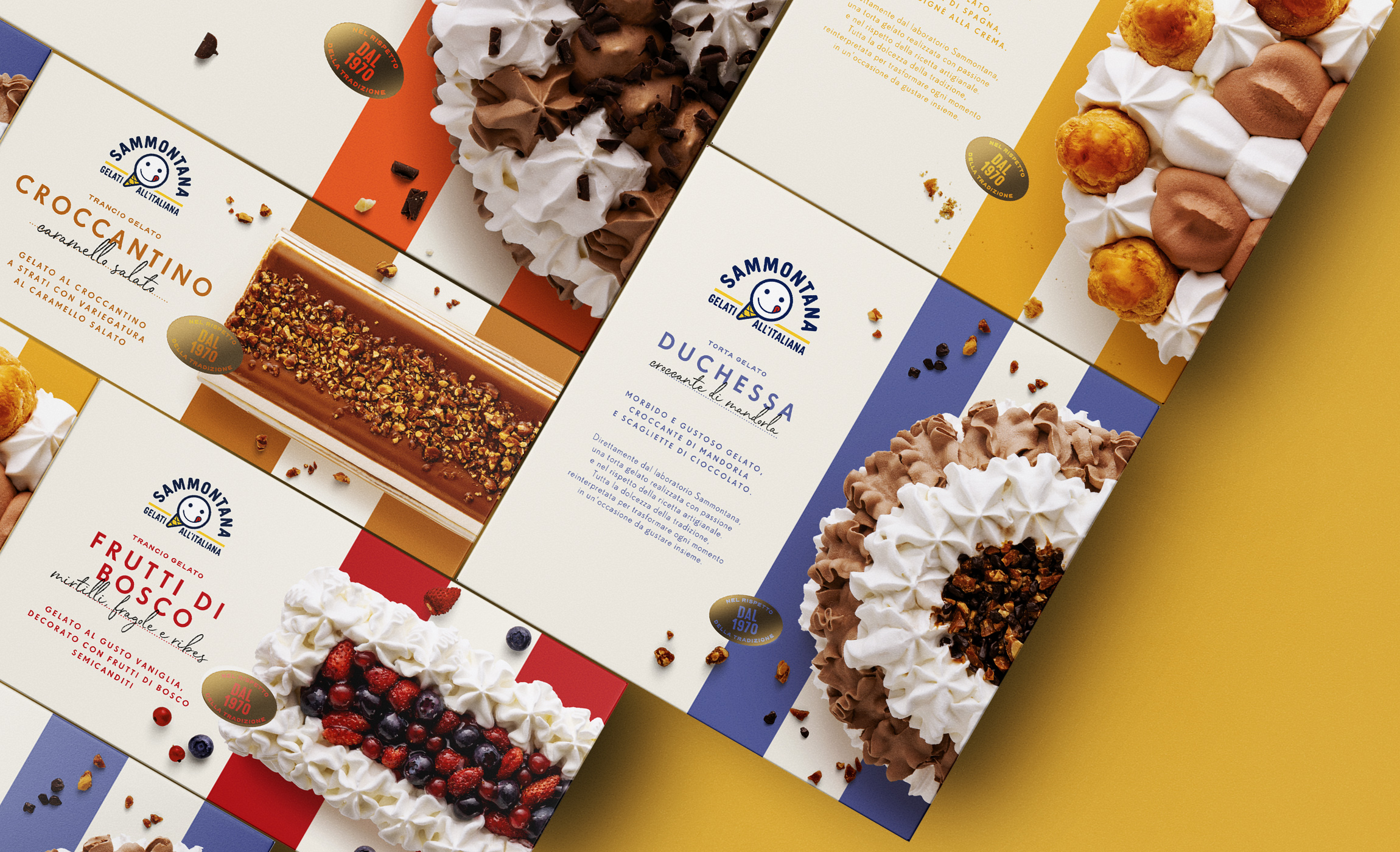
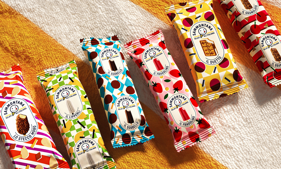
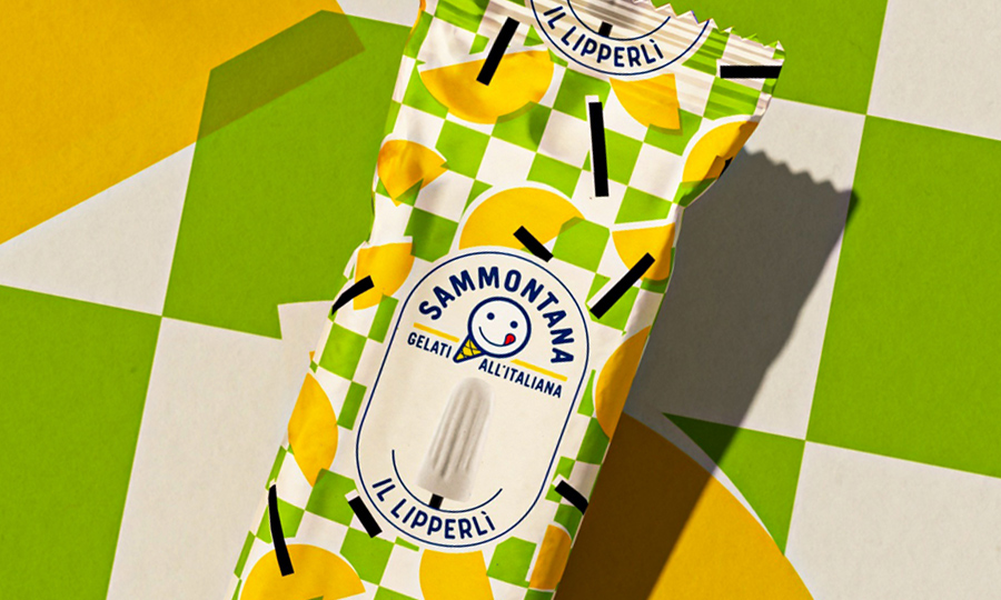
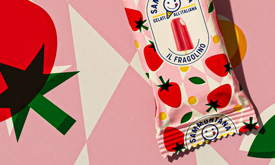
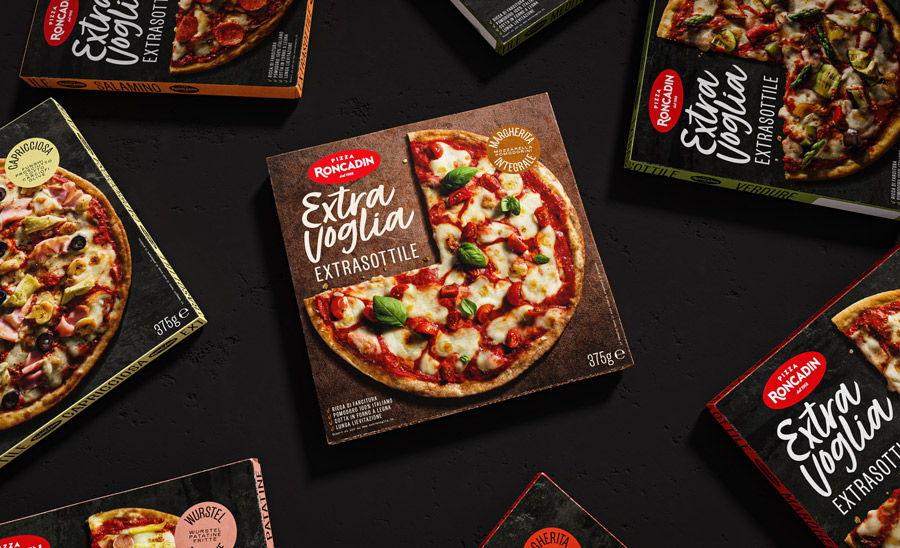
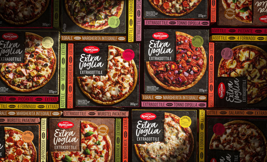
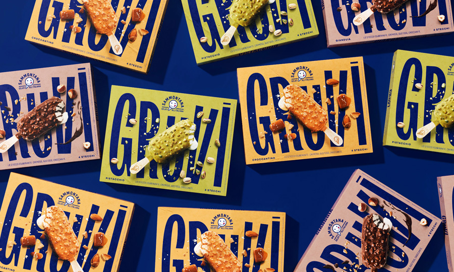
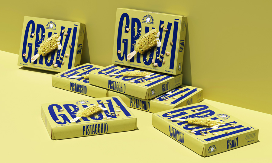
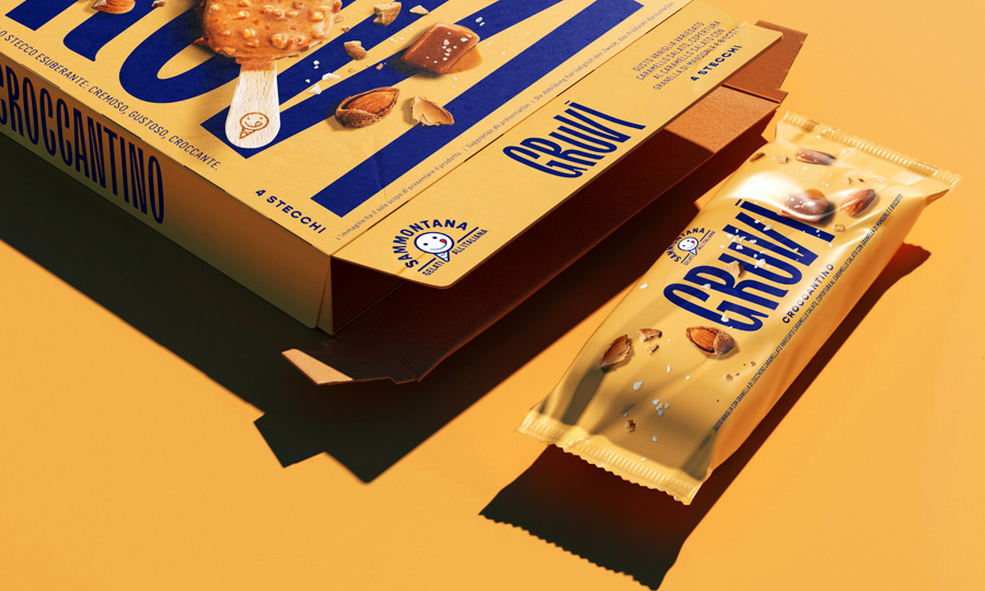
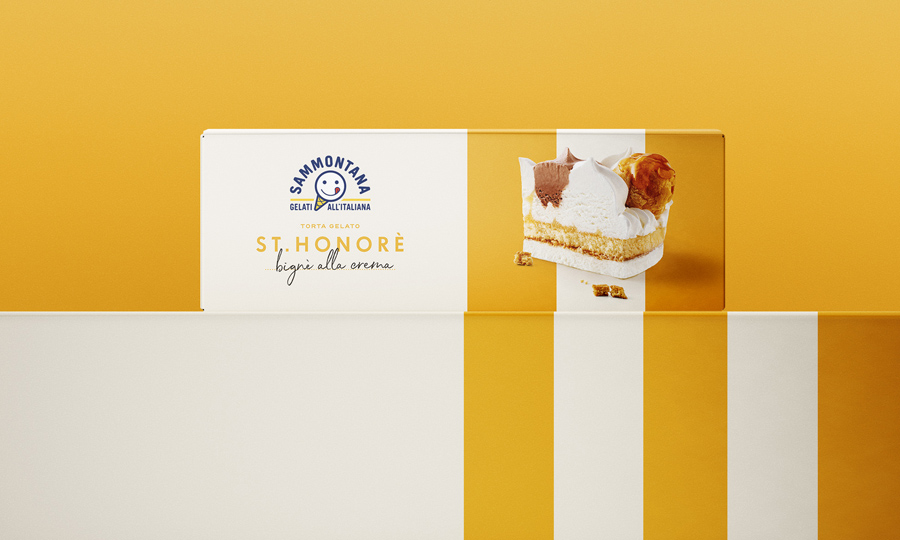
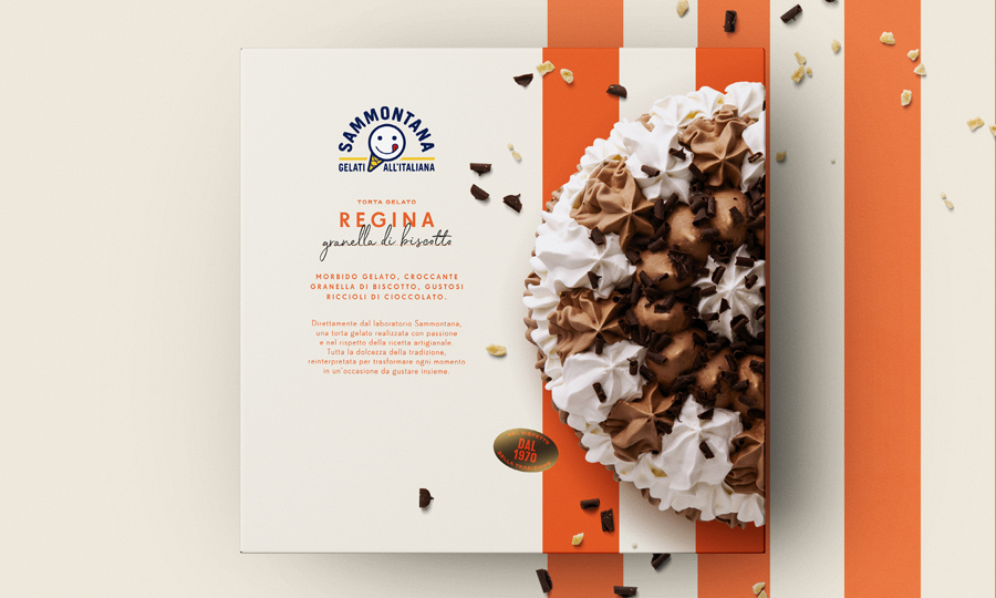
Giving a whole range of ice-cream cakes a refreshed look through the redesign of the product’s packaging. The product should look contemporary and of a high quality, keeping an Italian look alive.

Solution

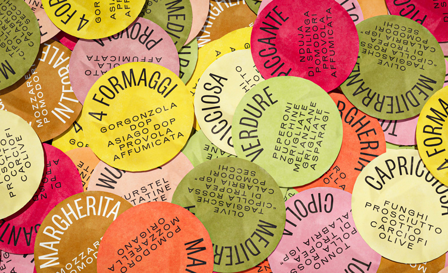
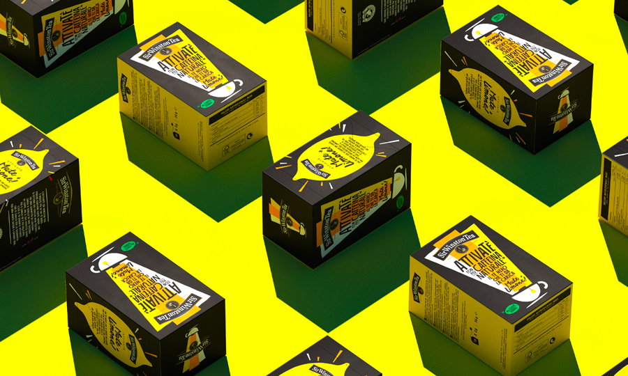
The packaging we designed looks sophisticated yet minimal, where the cakes’ pictures play with a graphical colored stripes pattern. Each side of the boxes shows a side of the product; on the top, an overhead point of view shows the cake at its best, capturing details and imperfections that make the product look sincere and authentic. The typographical approach is clean and elegant, and narrates of a non-artificial confectionery dimension. The stripes, when combined together, give birth to an impactful wall composition. The overall look is delightful and bright, and reflects an Italian visual imagery of colours, mood and emotion.

Process

Restyling of a 6 references’ range packaging; definition of a modern and balanced typography supporting a striped pattern; photographic art direction and digital composition.

Year / 2019
Share /
Facebook
Pinterest
Twitter
1/5
/ Related case
Sammontana UAU!
/identity /packaging
Cabrioni Biscotti
/identity /packaging
Kinder Emojoy 2018
/packaging

Auge Design Srl

Address /
Via Gino Capponi, 26
50121 Firenze – Italy

Contact /
+39 0550209446
info@auge-design.com

Follow /
LinkedIn
Behance
Instagram

Auge Design is proudly partner of Auge Headquarter