
Brancamenta Identity Retouch
- CLIENT
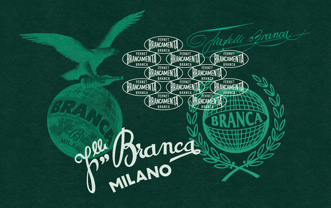
Brancamenta is an iconic Italian brand, part of the Branca family, renowned for its high-quality liqueurs. Introduced in the 1960s, it is crafted with Piedmontese peppermint and a secret blend of herbs and spices.
- ASSIGNMENT
In the context of an expanded communication initiative, the brand identified the need to slightly refine its logo and brand assets to enable their use in a more contemporary manner.
- SOLUTION & PROCESS
To achieve the proposed objective, work was carried out on the logo and its formatting, including the introduction of a new compressed logo that transforms BRANCAMENTA into an onomatopoeic chill: BRRR®. Additionally, historical elements of the brand’s visual identity were revisited and paired with a renewed color palette, bringing a sense of freshness back to the brand’s image. Or better yet, chills.


more