
Sammontana Cinque Stelle
- CLIENT
With over 70 years of history in ice cream making, Sammontana is the Italians’ favorite industrial ice cream and frozen goods brand. The Group operates in 5 production sites around the country and counts over 1000 employees. Sammontana indubitably means Italian Summer.
- ASSIGNMENT
Strengthen Sammontana’s “Il Cono Cinque Stelle” positioning as an icon of the Italian summer, highlighting ingredient quality, indulgence and its authentic Italian heritage. The new packaging system needed to convey premiumness, strong shelf impact and consistency across the different flavors, while preserving the brand’s historical identity.
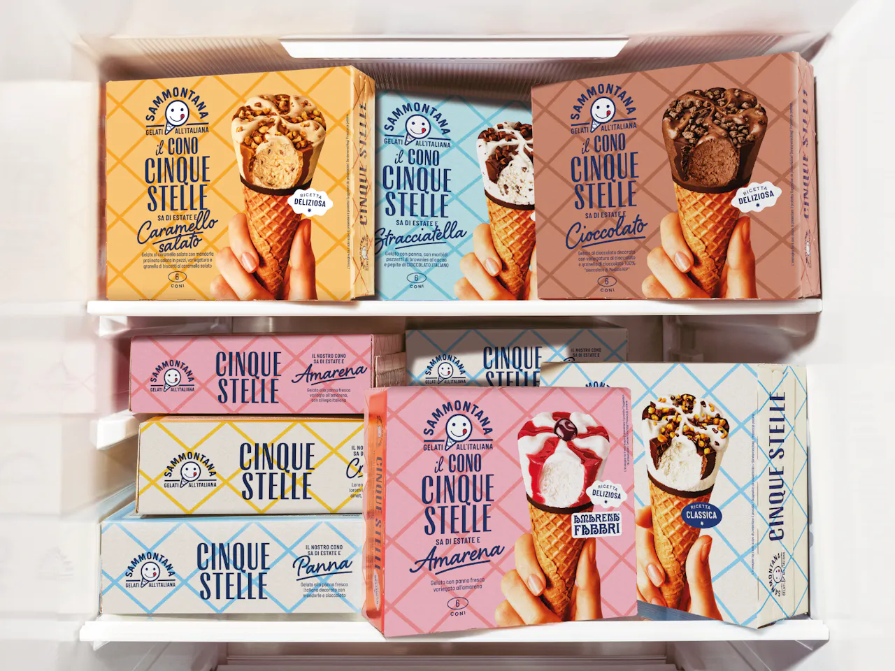
- SOLUTION & PROCESS
The redesign is built around a distinctive and structured visual language that balances tradition and contemporaneity. The diamond grid represents the waffle pattern and becomes a recognizable brand asset, evoking craftsmanship and attention to detail, while the color-coded palettes clearly differentiate the flavors, creating strong and orderly shelf presence. The Sammontana logo, rooted in Italian heritage, is enhanced and harmoniously integrated into the layout. Typography combines bold letterforms with elegant script accents to express a balance between solidity and indulgence, quality and pleasure. The product takes center stage: the cone is portrayed in a realistic and appetizing way, emphasizing creaminess, crunch and richness of ingredients. The result is a cohesive and scalable system that reinforces “Cinque Stelle” as a symbol of the Italian summer, a timeless classic, refreshed with a contemporary attitude while staying true to its roots.


more