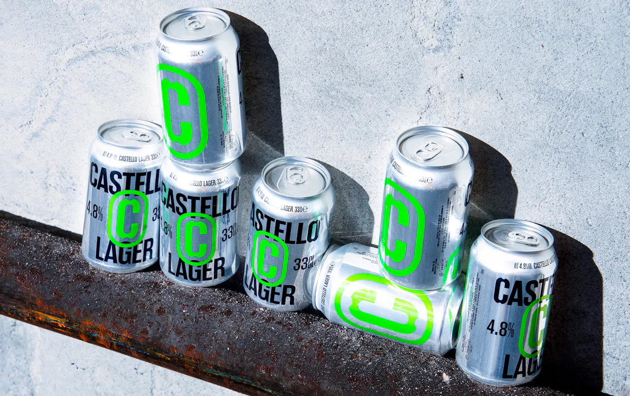

Birra Castello
- CLIENT
Birra Castello is an Italian brewery that stands out for its direct and transparent approach. It speaks to genuine, straightforward individuals who value real taste without compromise. No frills, no artificial storytelling, just good beer.
- ASSIGNMENT
The client requested a rebrand to reposition Birra Castello as a strong, distinctive brand. In a market crowded with competitors that build their identity around heritage and local roots, Castello takes a different direction, choosing not to talk about history, but about the beer itself.
- SOLUTION & PROCESS
Our new strategic approach cuts through unnecessary storytelling and marketing noise to focus on what truly matters: a well-crafted, authentic beer that speaks honestly and directly to its audience. The new identity translates this vision into a clean, bold and democratic graphic language that reflects Castello’s no-frills attitude. The visual system is built around an essential typographic structure, centered on the new Castello “C” badge, a strong and instantly recognizable symbol. A simple, contemporary typeface supports a straightforward tone of voice, reinforcing the brand’s honest and unpretentious nature, while the color palette retains Birra Castello’s iconic black and introduces vibrant variations across the range. That same strength and clarity extends to the can design: the raw steel highlights the brand’s honest, unpolished character, while the metallic finish adds a cool, powerful edge that reflects Castello’s new visual attitude.


