
Calvè
- CLIENT
Calvé, part of the Unilever portfolio, is one of Italy’s most established and recognizable sauce brands. Rooted in the everyday lives of Italian consumers, it has built its reputation around taste, quality, reliability and conviviality.
- ASSIGNMENT
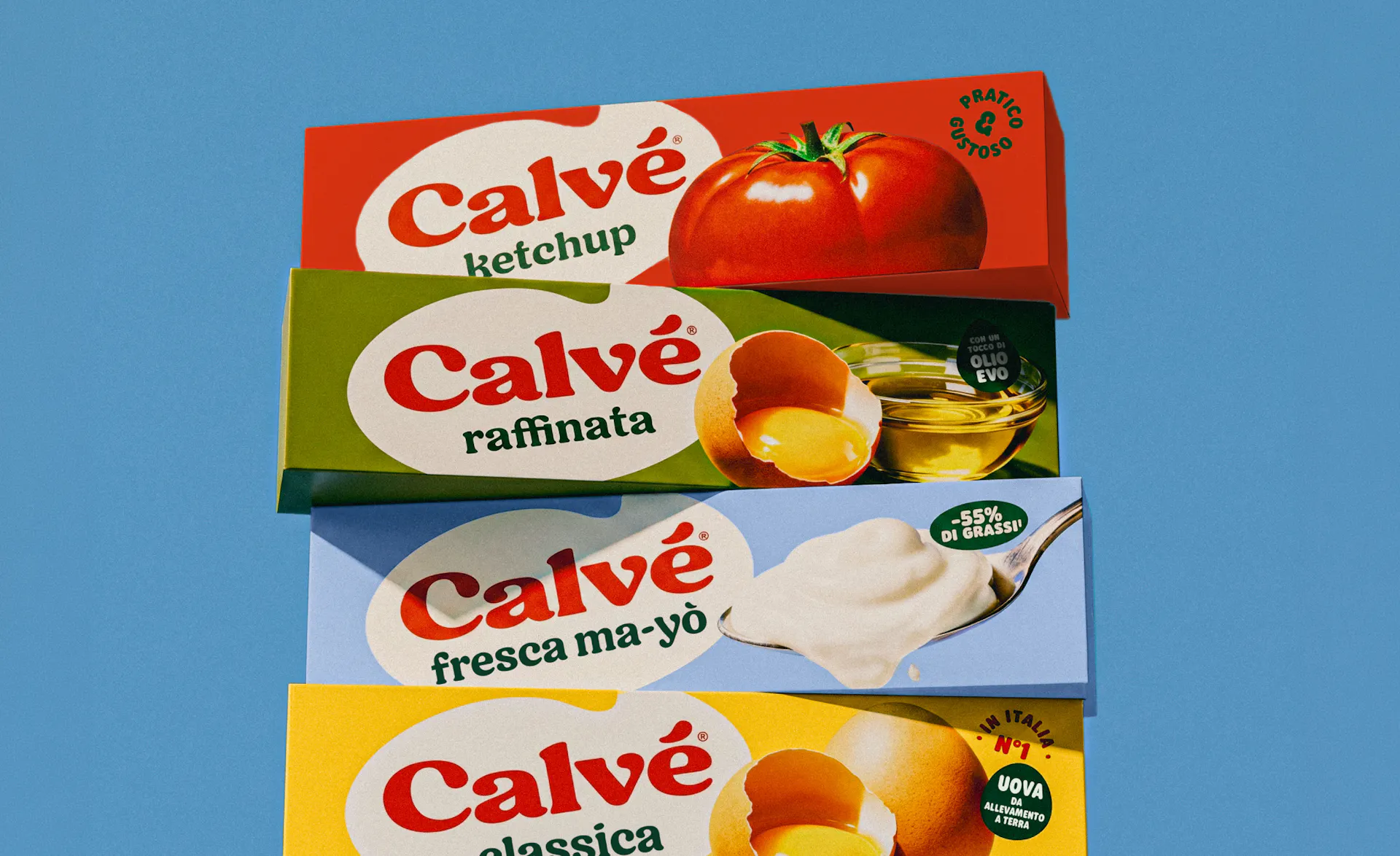
Calvé undertook a complete restyling of its brand identity, with the aim of renewing its visual language while preserving its strong heritage and immediate recognizability. The challenge was to make the brand feel fresher, more desirable and relevant to younger audiences, bringing the quality and sensorial appeal of the product back to the center of the experience.
- SOLUTION & PROCESS
The work started with the logo, transforming Calvé’s signature creaminess into a distinctive graphic feature. Soft curves and rounded letter endings evoke drops of sauce, while the accent becomes an iconic asset that can live independently across the identity. The same sensorial approach shapes the entire visual system. The packaging was simplified and reorganized to increase clarity, recognition and impact, while the iconic Calvé yellow was preserved within a fresher and more contemporary color palette. Photography plays a central role, using immersive close-ups, rich textures and expressive food compositions to make taste immediately visible. The result is an identity that balances continuity and evolution: cleaner yet richer, familiar yet contemporary, and capable of repositioning Calvé from a practical condiment to an ingredient that adds taste, character and pleasure to everyday food.

















more