
Meurisse
- CLIENT
Meurisse is Belgium’s first chocolate company, with a rich heritage dating back to 1845. With a long history of craftsmanship and a familiar visual identity, the brand continues to explore new ways of expressing its story while staying connected to the elements that customers have grown accustomed to.
- ASSIGNMENT
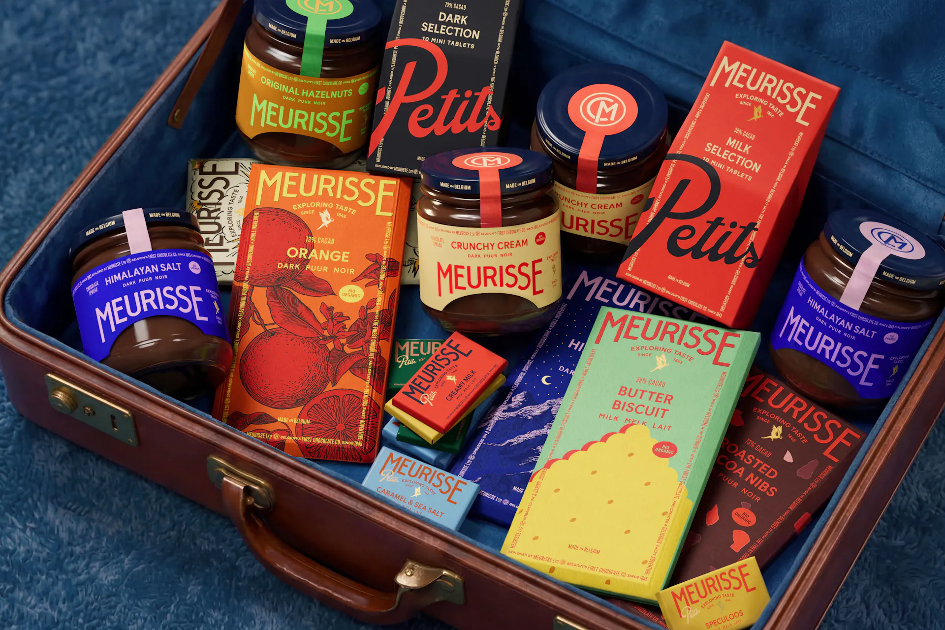
The branding system started with a simple idea: keep the arched logo and frame that customers have grown accustomed to, but give them a more meaningful role. The aim was to bring more presence, elegance and purpose to these familiar elements, creating a visual identity that could tell the story of Meurisse’s travels while celebrating its long-standing heritage.
- SOLUTION & PROCESS
What was once a simple outlined window and a classically arched logo becomes something with a little more presence, elegance and purpose. The arch takes a new, stair-cased form, giving the logo the feeling of a movie headline announcing the beginning of a great adventure. The arch and frame become the little stage on which Meurisse’s travels unfold, holding stories from the many places he has visited along the way. Across the different chocolate formats, the frame changes character, becoming a postcard or a wrapped souvenir from somewhere far away. Every pack carries the line ‘exploring taste since 1845’, accompanied by refreshed archival symbols such as the CM mark, small reminders that although Meurisse is always travelling forward, he has been on the journey for quite some time. And so the chocolates continue on their way, aboard the Orient Express, carefully packed, labelled and ready for their next destination.














more