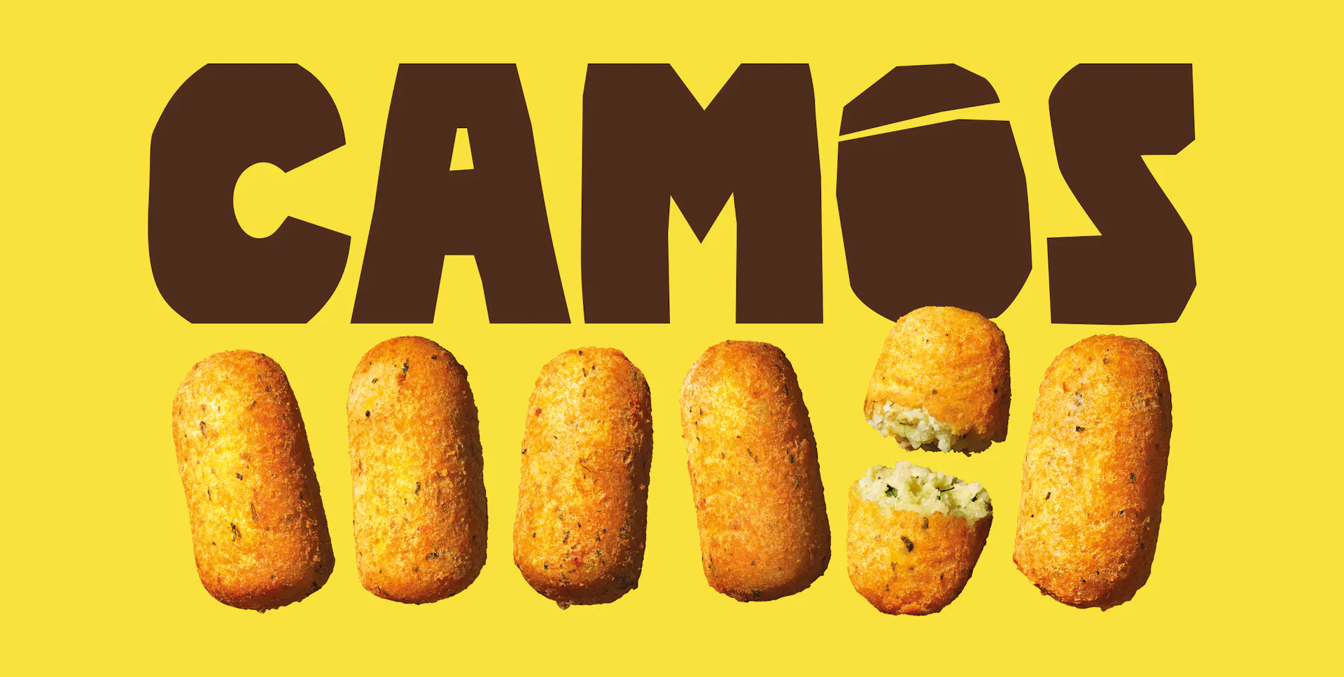

CAMÓS
- CLIENT
Camós takes one of Spain's most iconic comfort foods and resolves its core contradiction: maximum satisfaction, zero guilt. The product makes it possible — potato-based, few natural ingredients, no béchamel, no preservatives, no lactose or gluten. Same indulgence, no trade-off.
- ASSIGNMENT
The goal was to translate this positioning into a distinctive visual identity able to communicate the product's essence without filters, while creating strong visibility, recognition and clear differentiation across the range.
- SOLUTION & PROCESS
The visual identity starts from the product. The logotype is built on sharp forms inspired by the cut potato: a graphic, immediate mark that communicates the brand's essence without filters. The color system has the same origin: yellow for the inner potato, brown for the skin. As croquettes are made from the filling, yellow dominates — driving visibility and recognition. Vibrant, SKU-specific colors complete the system, creating contrast and clear differentiation across the range. Typography works through tension: bold for indulgence, rounded for softness. The tone of voice follows the same logic — direct, almost loud, using the codes of indulgent food stripped back to their core. Product, positioning and design converge into a coherent system that redefines comfort food: satisfying, and guilt-free.











more