
Gelato merenda Plasmon
- CLIENT
With over 70 years of history in ice cream making, Sammontana is the Italians’ favorite industrial ice cream and frozen goods brand. The Group operates in 5 production sites around the country and counts over 1000 employees. Sammontana indubitably means Italian Summer. Founded in 1902, Plasmon is an Italian brand that specialises in baby food. Thanks to the quality and safety of its products, the company has become a trusted name among families. The company has always been renowned for its commitment to nutrition and meticulous ingredient selection.
- ASSIGNMENT
The Plasmon-Sammontana collaboration aimed to create packaging that inspires warmth and nostalgia while communicating quality with a contemporary, playful touch. The aim was also to celebrate two historic Italian brands with a design that would appeal to adults and children alike, conveying trust, joy and a strong sense of Italian identity.
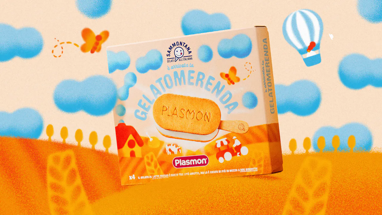
- SOLUTION & PROCESS
The design solution for the packaging is based on a clear and harmonious visual division, intended to represent the collaboration between the two brands. The lower part is dedicated to Plasmon’s universe, featuring a countryside illustration, a distinctive and recognizable element of the brand, in shades of orange, Plasmon’s iconic color. The upper part reflects Sammontana’s visual identity, with a cream-colored background and details such as clouds, an airplane, and a hot air balloon, all in blue hues that evoke the softness and sweetness of the ice cream world. This approach creates a clear graphic and colour distinction, using each brand’s signature colours. The two brand identities are visually united by a large, continuous illustration that extends across the entire packaging surface. This provides narrative coherence and celebrates the collaboration between two historic symbols of Italian heritage. The soft-edged, delicate, grainy illustrative style helps create a tender, playful visual tone that is perfectly aligned with a childlike, welcoming aesthetic. The photo of the ice cream is seamlessly integrated into the illustration, symbolising the sun that illuminates the entire landscape stretching across the entire package.


more