
Sammontana Amando
- CLIENT
With over 70 years of history in ice cream making, Sammontana is the Italians’ favorite industrial ice cream and frozen goods brand. The Group operates in 5 production sites around the country and counts over 1000 employees. Sammontana indubitably means Italian Summer.
- ASSIGNMENT
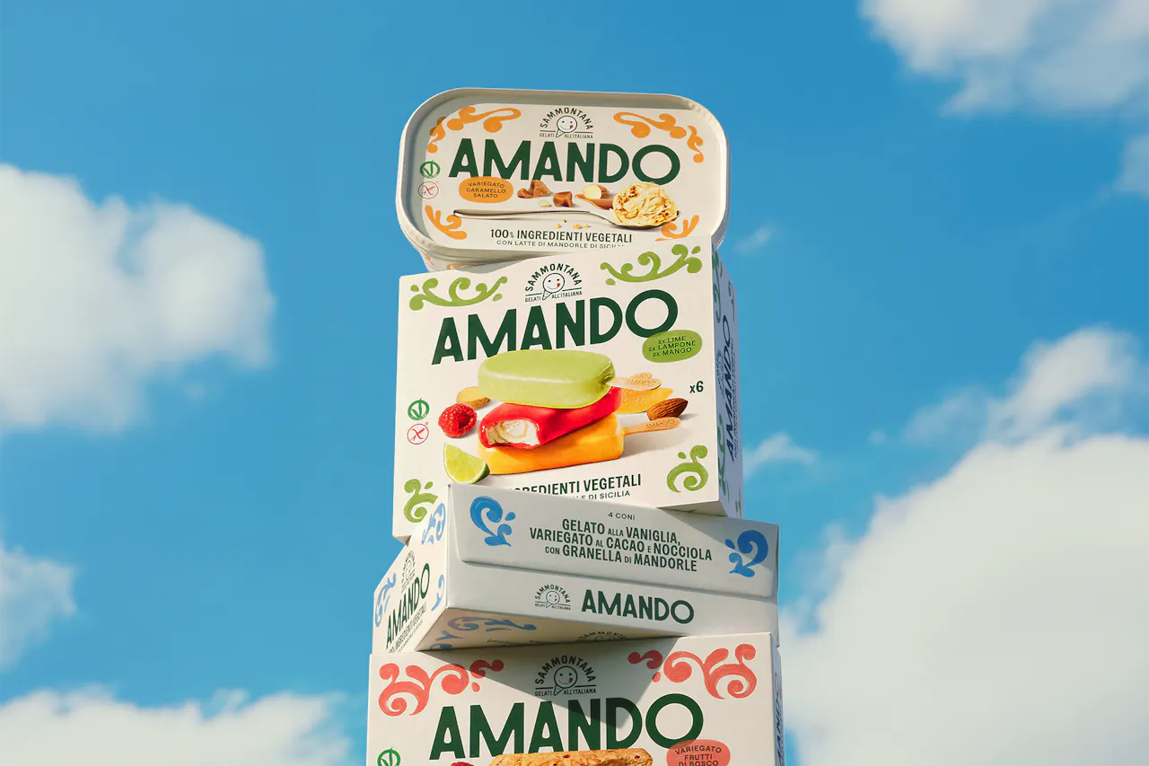
The project aimed to relaunch Sammontana’s “Amando”, milk-free range, based on 100% plant-based ingredients and a delightful Sicilian almond milk ice cream. The new identity and packaging needed to convey the brand’s core values—sustainability, quality and Italian roots — targeting individuals seeking a milk-free yet delicious gelato.
- SOLUTION & PROCESS
Amando’s new visual identity embraces a clean, natural and sunny graphic language. A new smooth and elegant logo inspired by historical Italian typography, subtly recalls the almond shape in its counterforms. Illustrations take center stage, bringing Sicily to life with a contemporary touch, decorating the packs with colorful hand-painted frames recalling traditional Sicilian ceramics. An ice cream that proudly tells a new, Italian story celebrating simple and authentic pleasures. The result is a cohesive visual system that makes plant-based gelato truly desirable.


more