
Rana Pasta Fresca
- CLIENT
The Giovanni Rana fresh pasta factory was born as an artisan, Italian small shop of fresh pasta in the after war. The great intuition that transformed the company from a small reality into a large company was to produce fresh pasta for mass consumption. It was the 60s and the first to be produced and distributed were the famous tortellini – today, thanks to continuous research, creativity and respect for quality, the company can boast a portfolio of over 1000 different references distributed in 52 countries and the opening of factories also in the USA.
- ASSIGNMENT
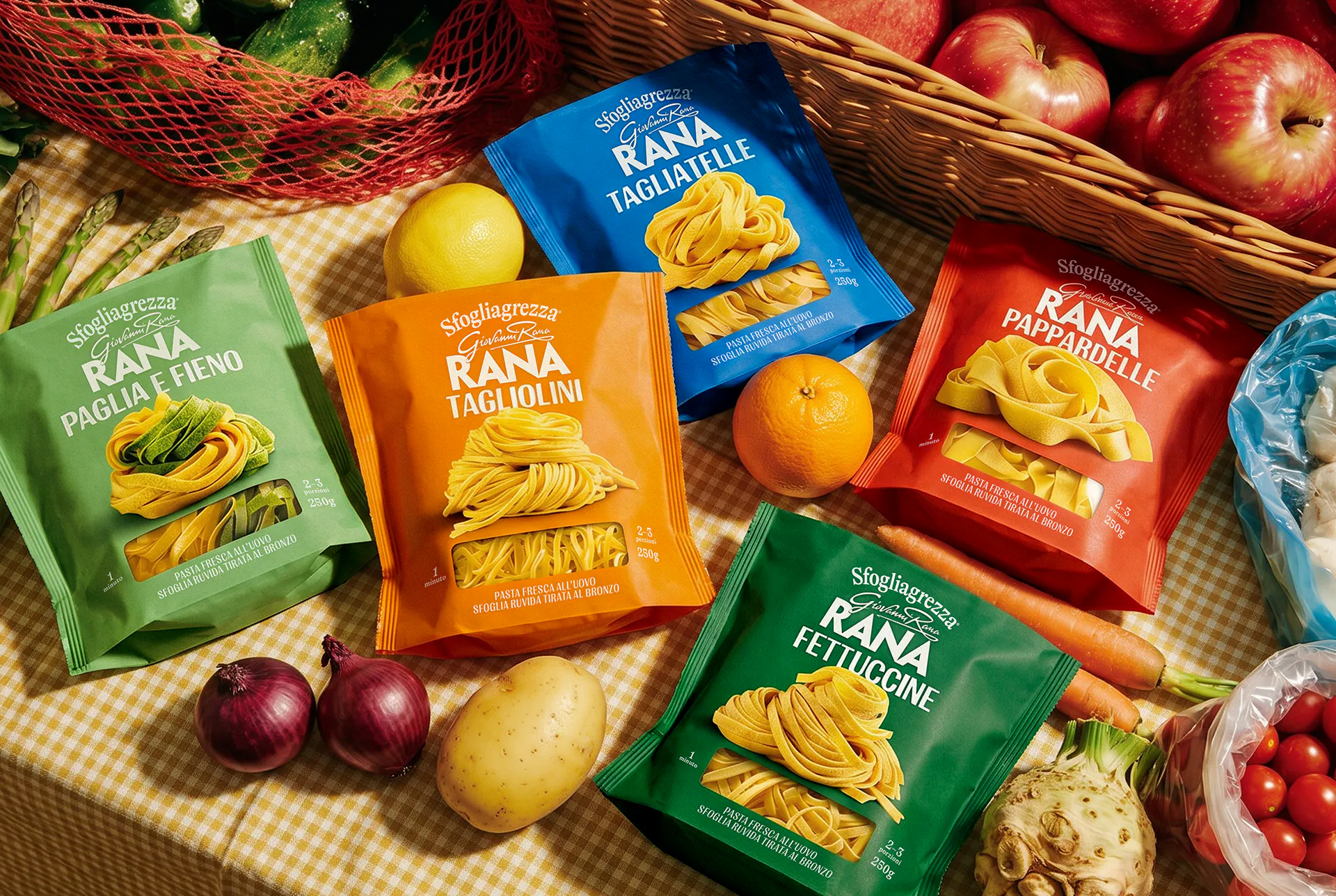
Following the redesign of the fresh filled pasta range, the challenge was to extend the new visual identity to the fresh pasta range, ensuring full consistency with the design system already established for the brand. The new packaging needed to align with the architecture, visual codes and iconic character developed for the filled pasta range, while clearly differentiating the various pasta cuts through a simple, recognizable and cohesive system.
- SOLUTION & PROCESS
Building on the design language created for fresh filled pasta, we developed a packaging system that combines consistency with strong shelf impact. The portfolio is organized through a clear color-coded architecture, while bold typography and large, appetizing pasta visuals immediately identify each format. The range descriptor arches above the Rana logo, reinforcing the brand's heritage and recalling the signage of traditional Italian pasta shops. The result is a fresh, contemporary identity that enhances product recognition, celebrates the quality of the pasta itself, and creates a seamless visual connection across the entire Rana fresh pasta portfolio.





more