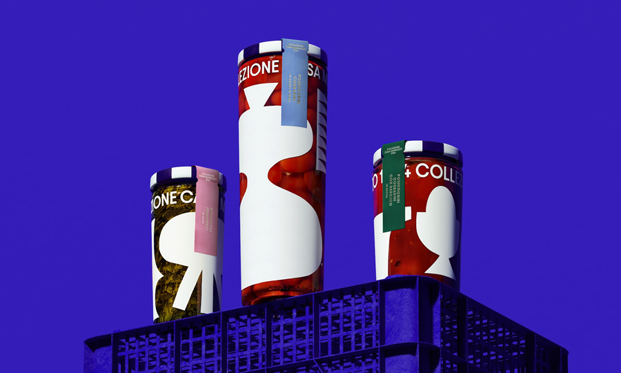


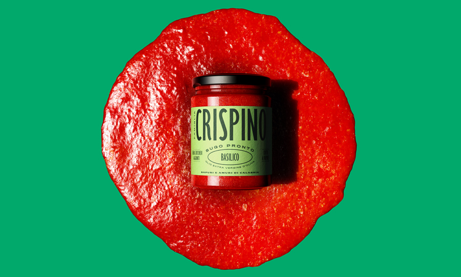
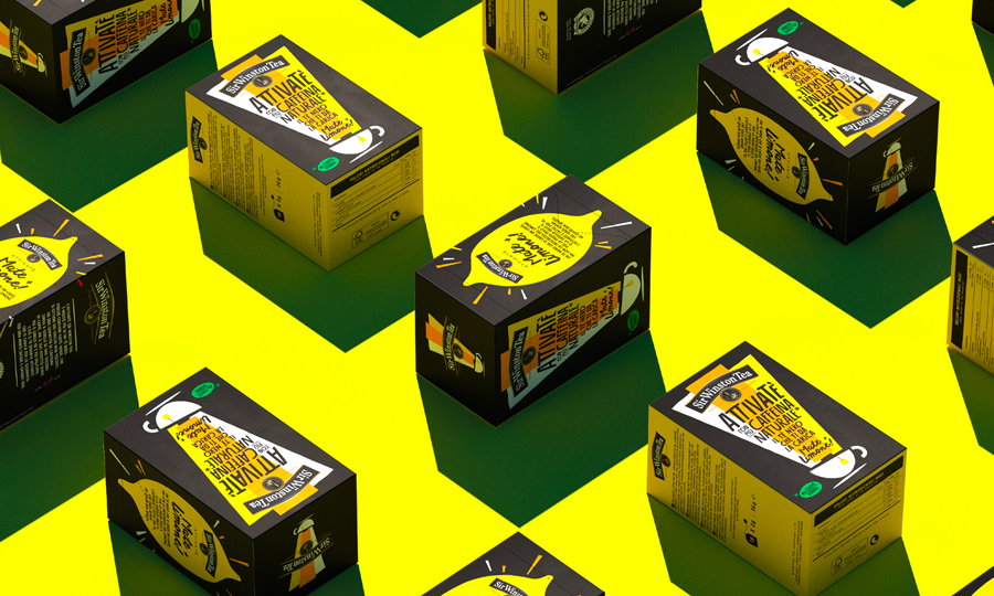


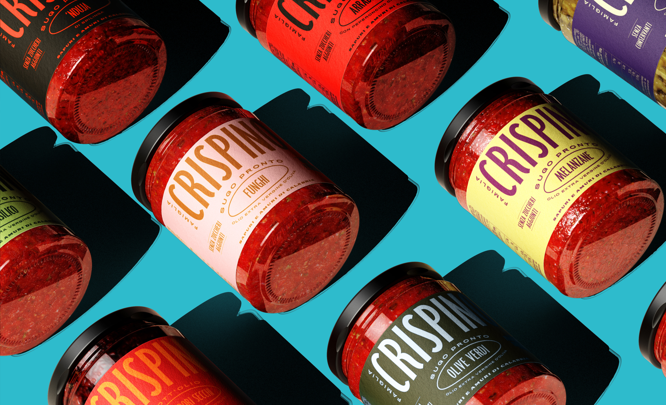
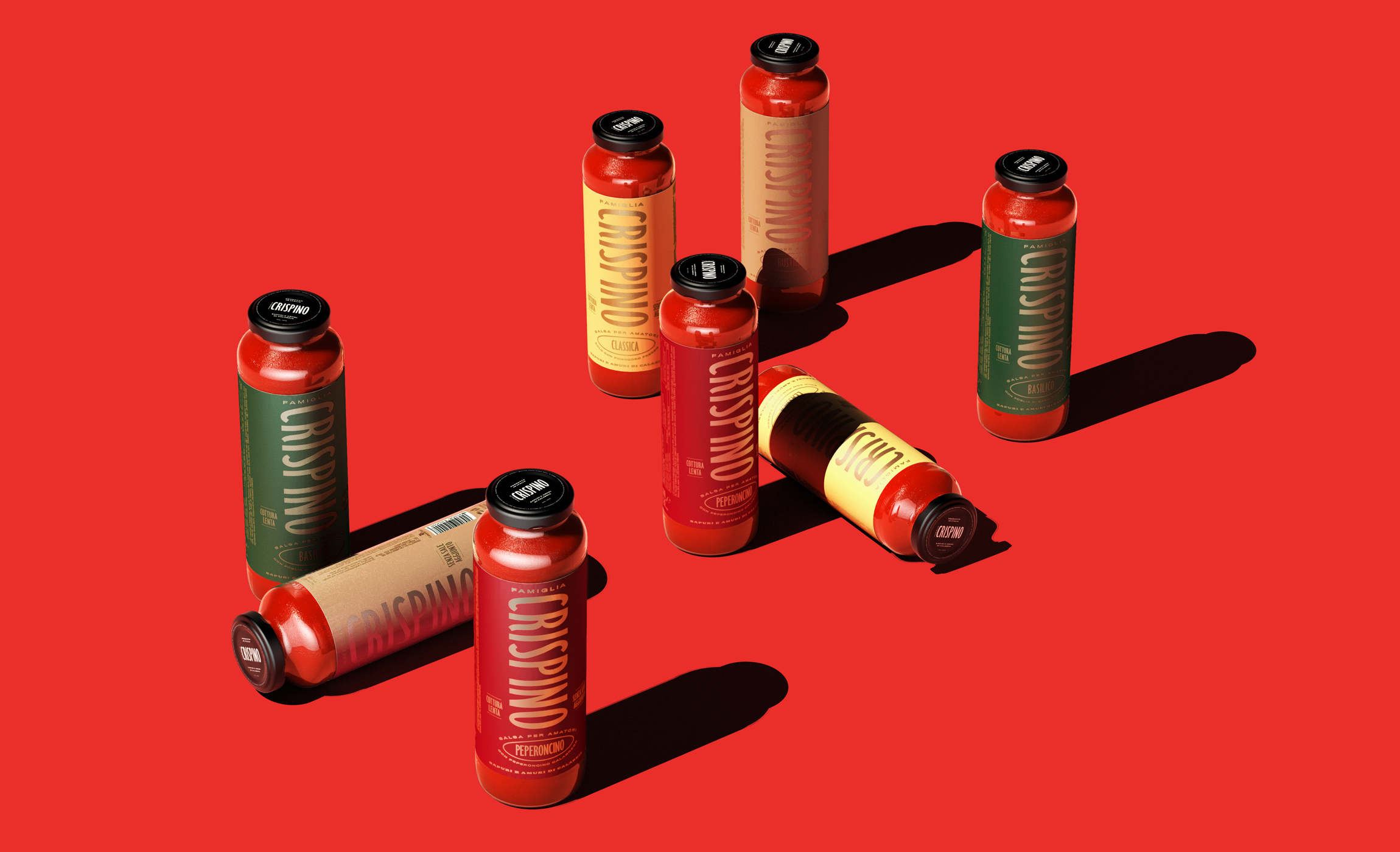
/ A colorful label system that allows the brand to embody the authentic spirit of Calabria: check out Famiglia Crispino’s new look.
Famiglia Crispino is a Calabrian family-run company producing all kind of groceries and distributing them in Italy and abroad. Specialized in tomato sauces, food preserves and pickled products, with over half a century of history Famiglia Crispino is probably one of the most important representatives of Calabrian Eno-gastronomic’s culture and products.
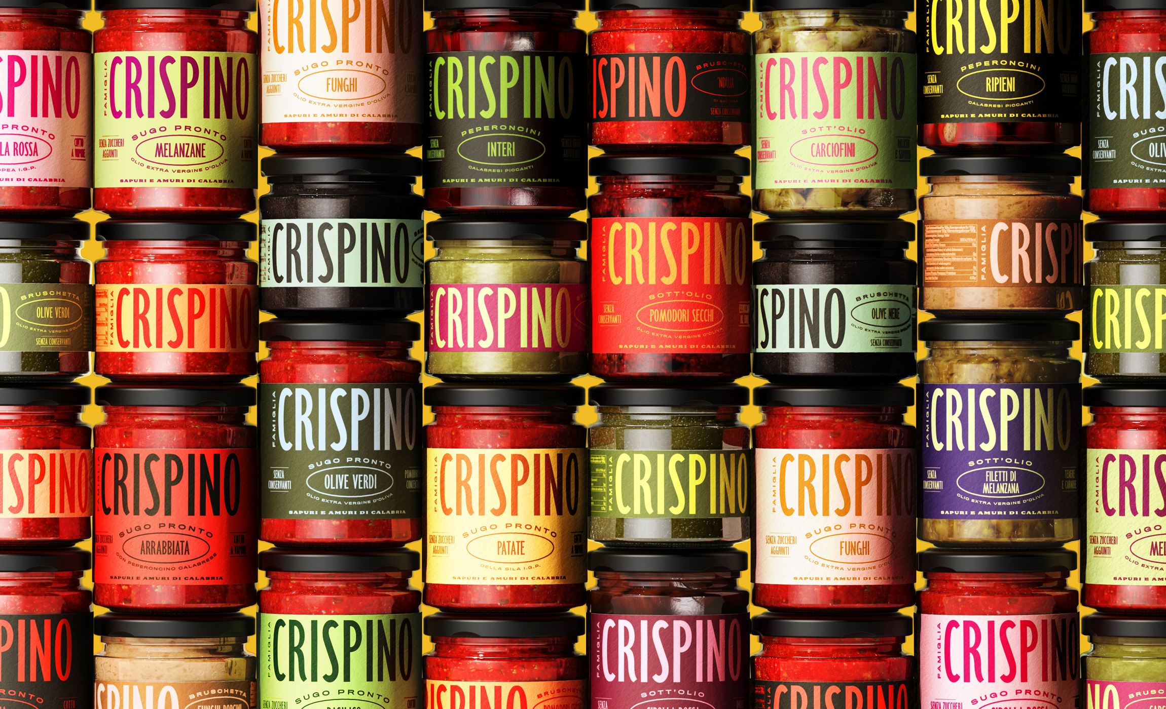
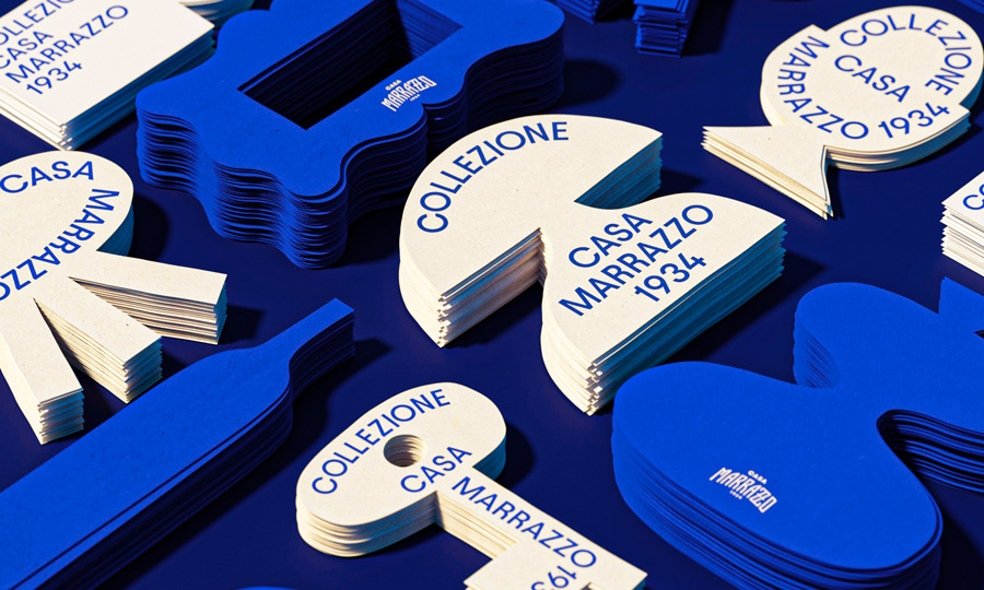
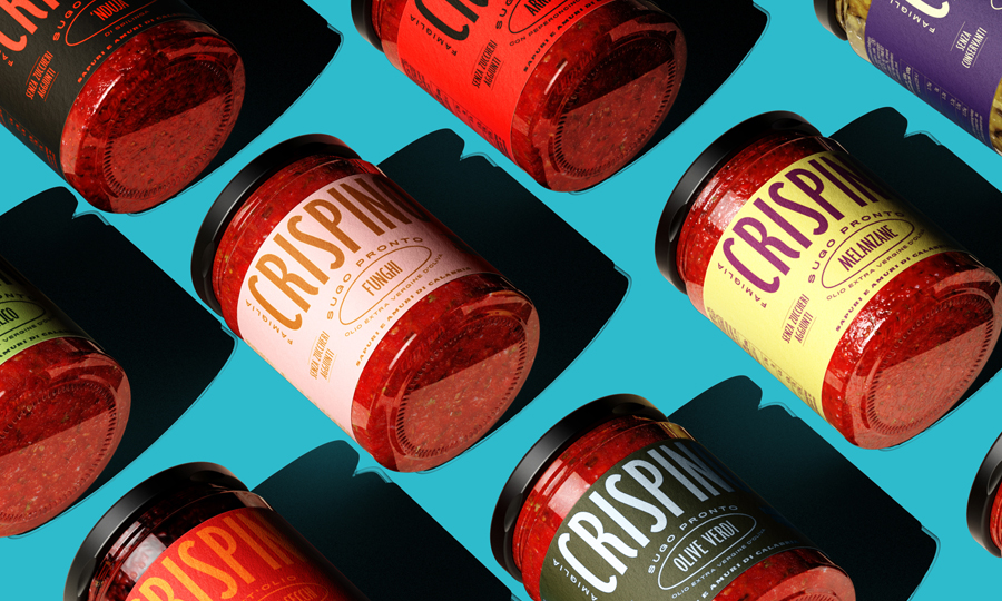
Developing a new naming for the brand and the collateral new logo and brand identity; structuring a brand-new products’ architecture and designing a label system for the several products references and their different sizes.
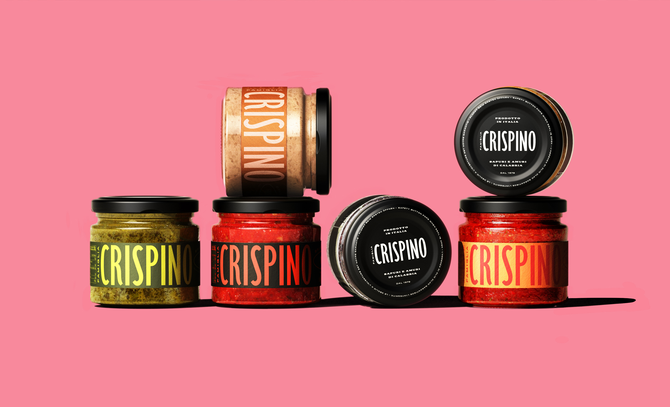
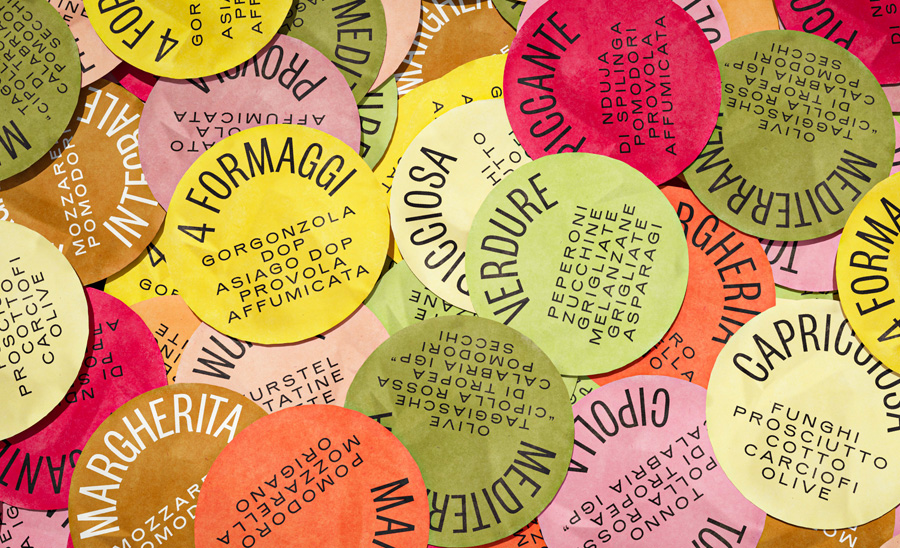
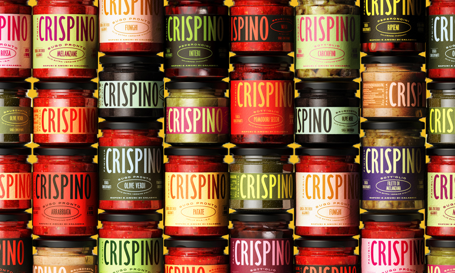
We created an impactful and colorful label system, where audacious chromatic combinations in addition to a bold use of logo and typography make the product stand out from a really traditional shelf, narrating in the meantime true Calabrian values such as vivacity, energy, taste and strong flavors. The typography adopted in the logo (as well as in the reference and the descriptors) is a custom typeface we specifically designed for the project. The great variety of products that the brand offers, makes it possible to create stunning jar walls and outstanding in store corners.
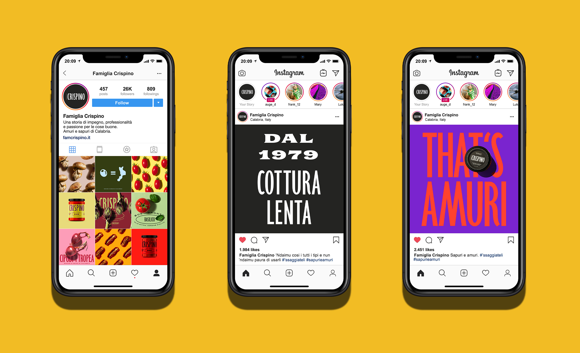
Creation and definition of a new naming, logo and brand identity, including the consequent study of a larger colour palette and the study of the products’ labeling system. Development of a typographic ecosystem involving a specifically designed custom-made typeface for the brand. Styling and art-directing of some of the communication materials, definition of the photographic style and the overall brand’s look.
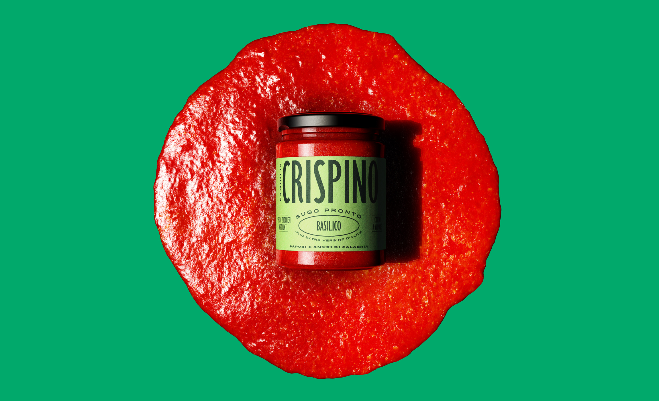


/ Calabria Sans. A custom typeface specifically designed for Famiglia Crispino.