
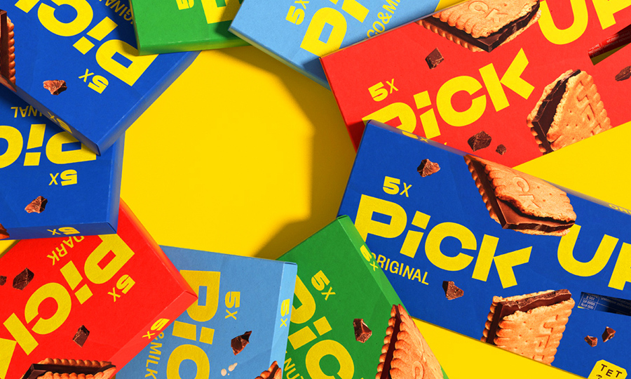

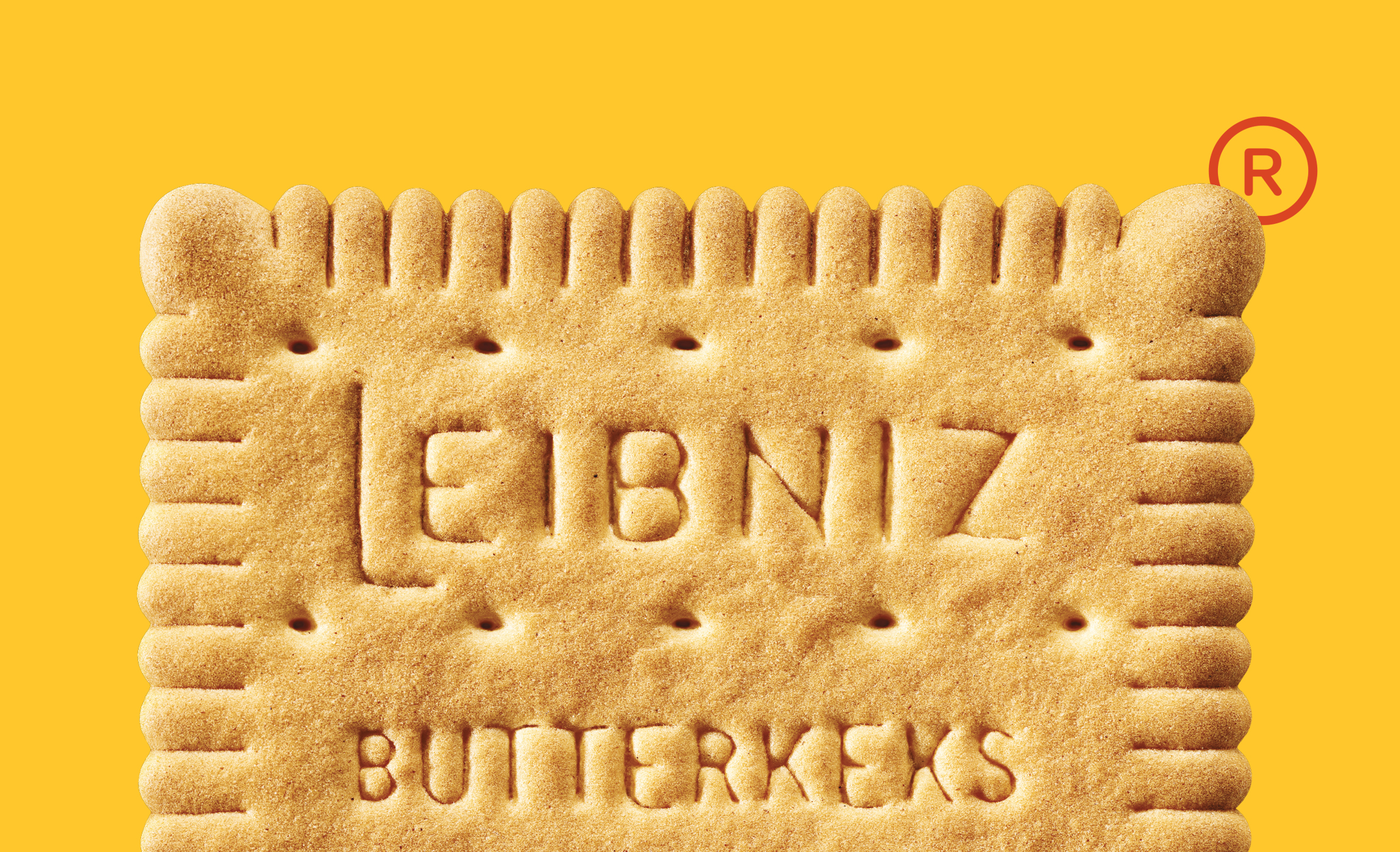
/ 52 teeth that represent the most iconic biscuit shape in people imaginary. This is Leibniz.
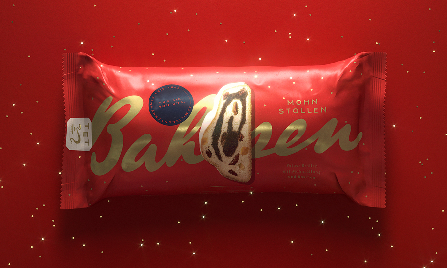
The German family enterprise Bahlsen is an international sweet biscuit manufacturer. In Germany Bahlsen is the most successful manufacturer in this market and with the brands BAHLSEN and LEIBNIZ market leader. Also throughout Europe, Bahlsen is one of the most successful sweet biscuit companies. The company’s roots go back to 1889, when Hermann Bahlsen founded the “Hannoversche Cakes-Fabrik H. Bahlsen” and employed ten people. Today, more than 130 years later, the company has an international presence with its biscuits, waffles, chocolate bars and cake, employing 2,750 people, with a turnover of 540 million euros in 2019.
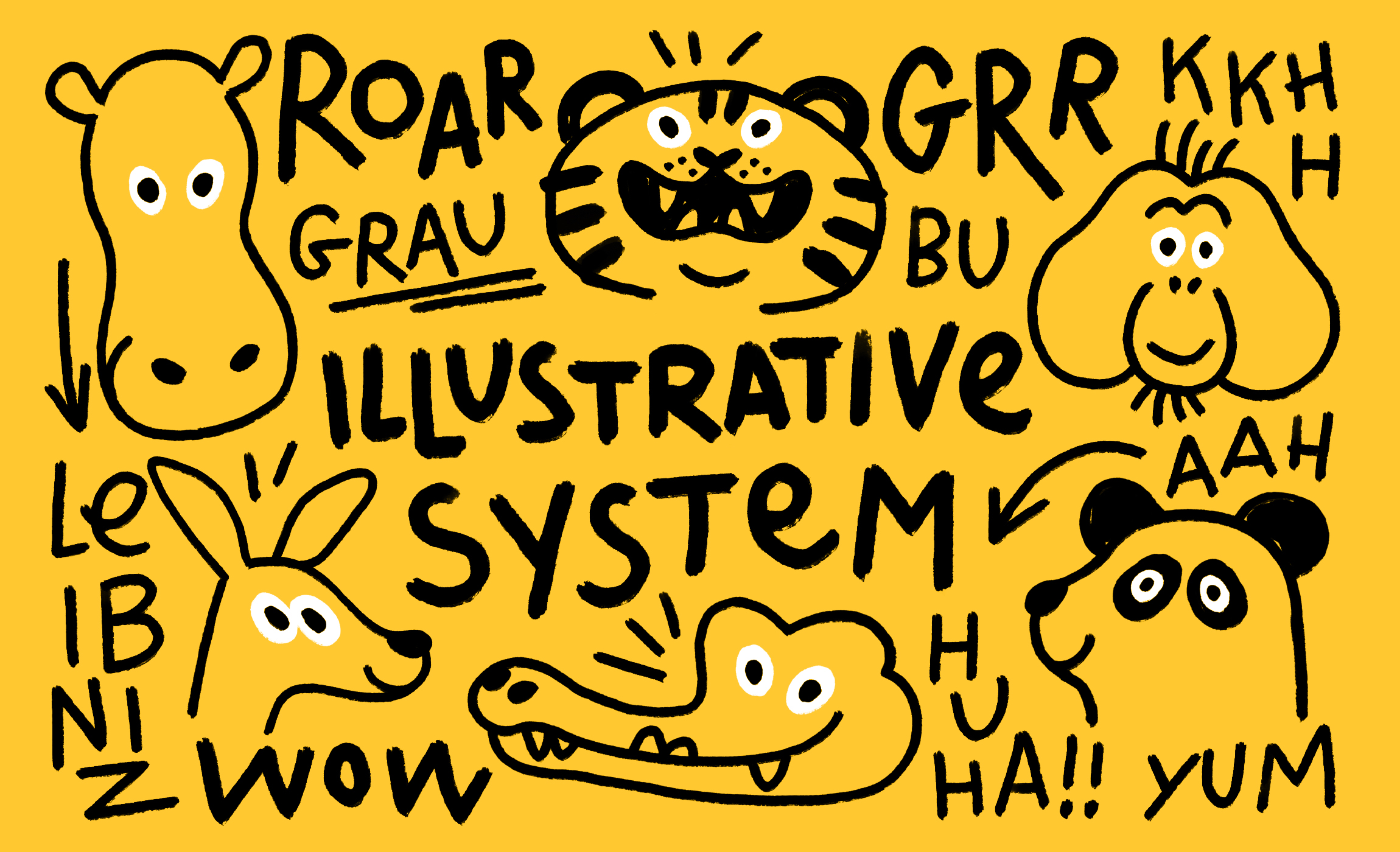
We were asked to revamp the branding and packaging design by creating a fresh, new language able to talk to the new generations, kids and young families and delivering the naturalness and goodness of the product. Always remember the iconicity and warm attitude of the Brand.
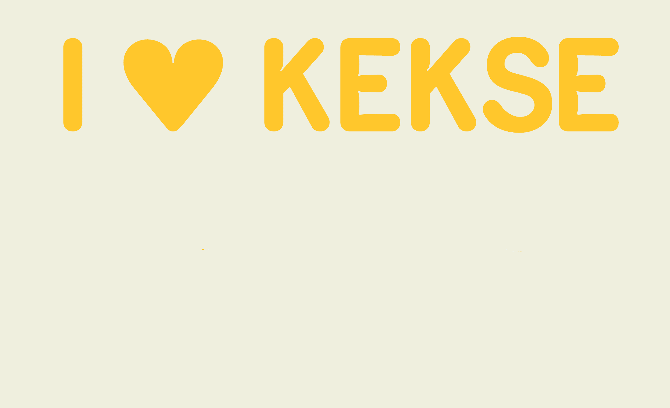
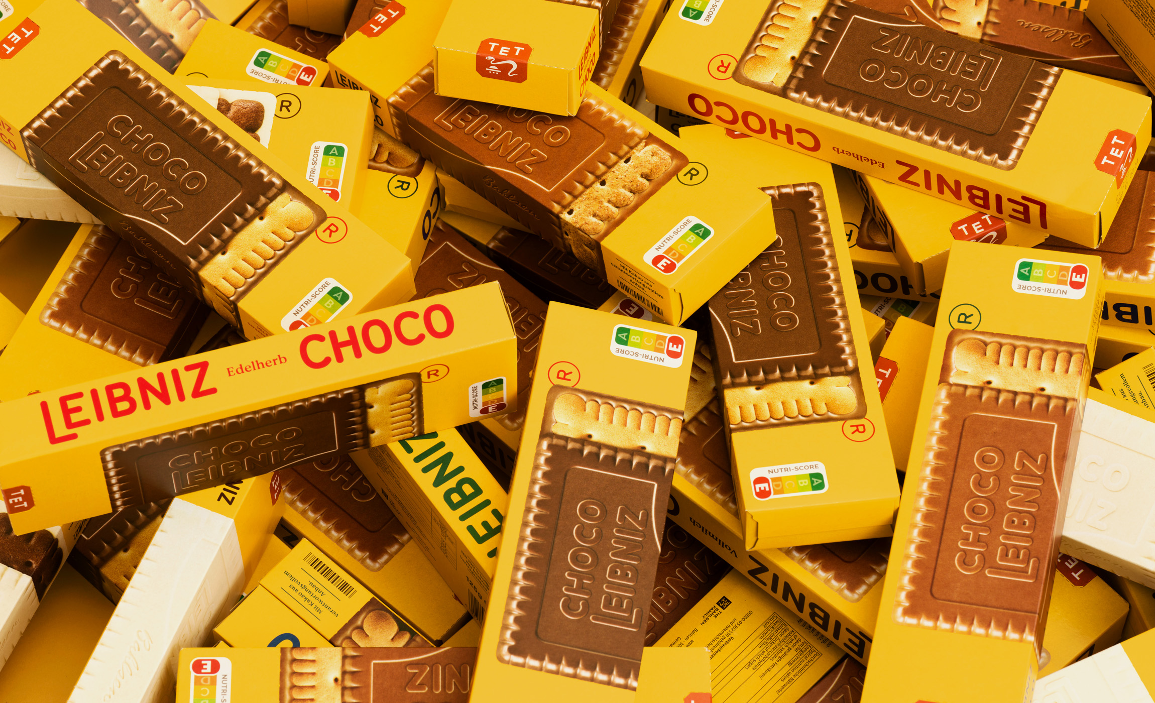
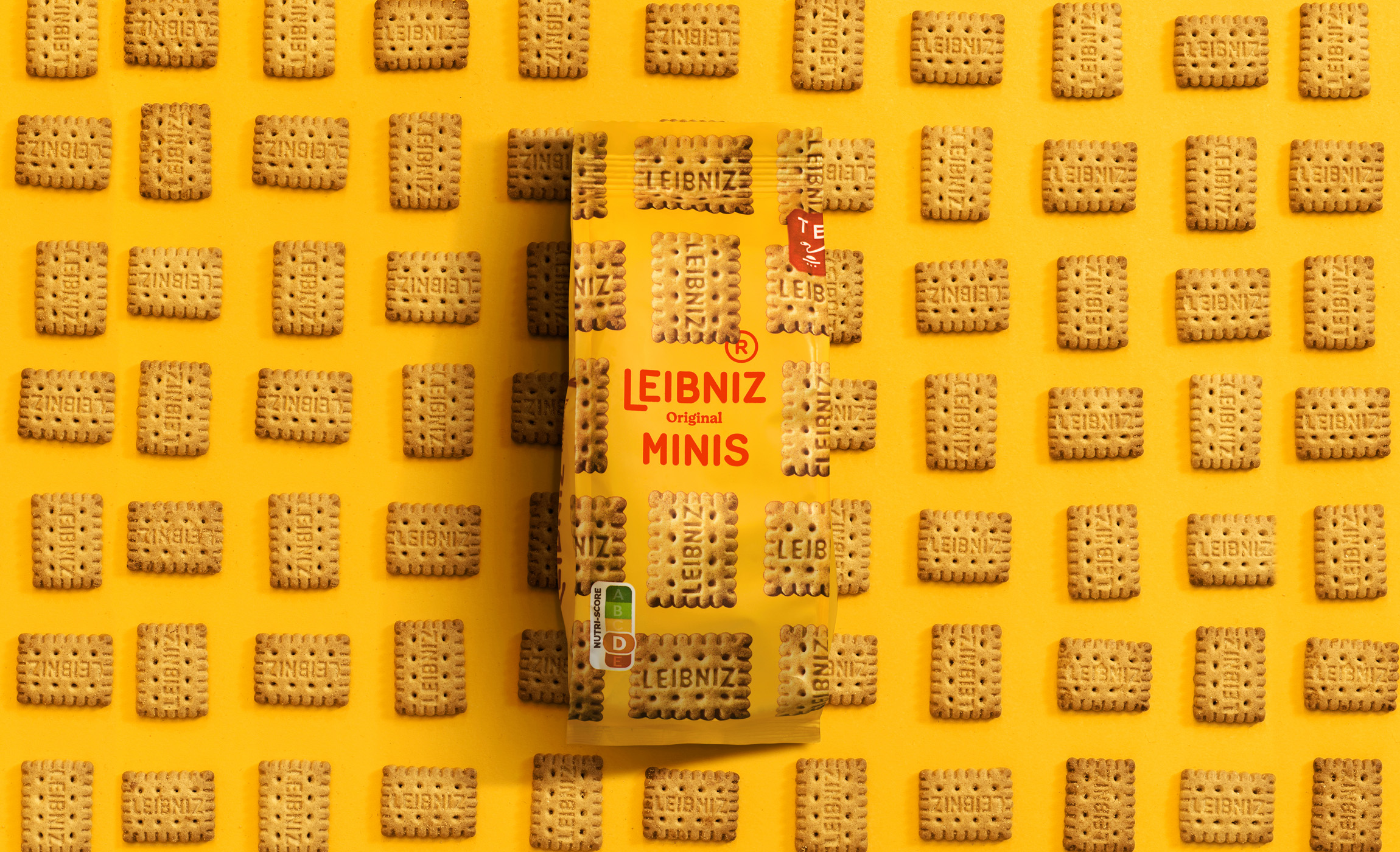
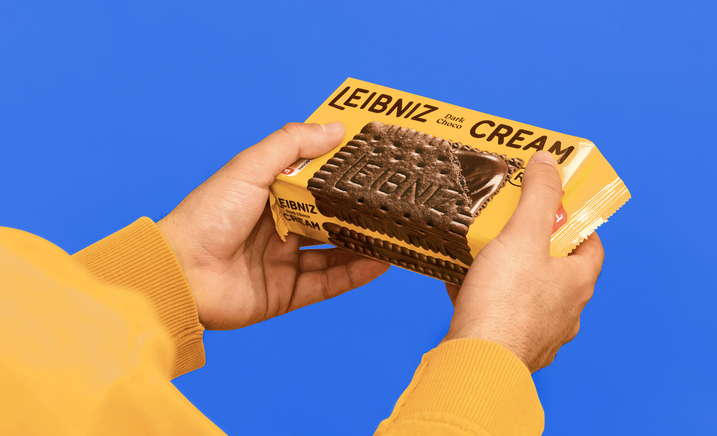
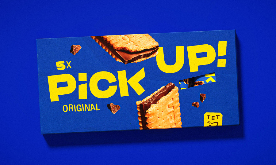
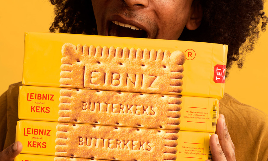
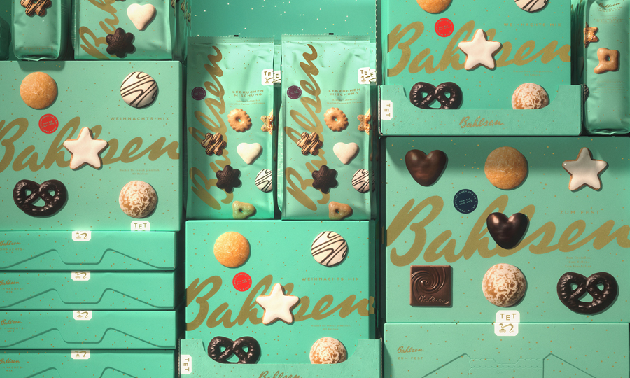
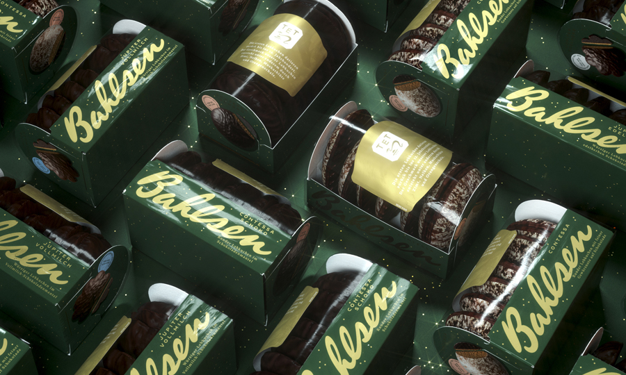
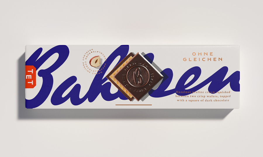
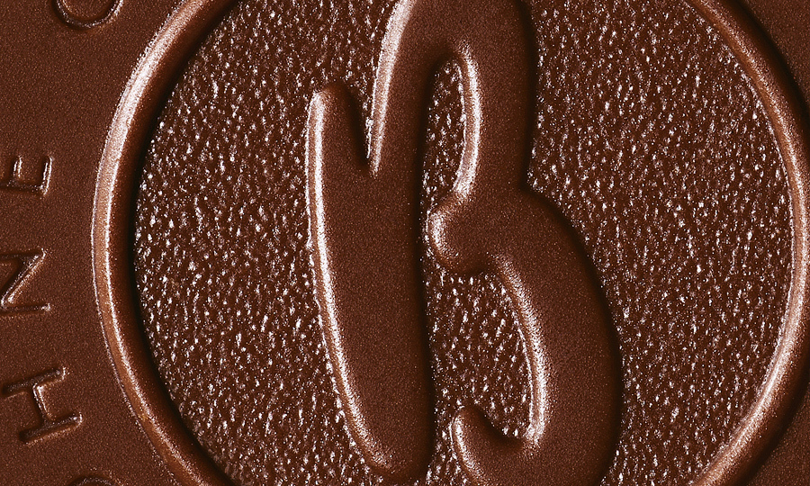
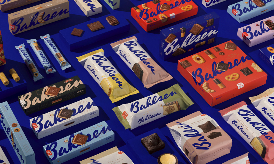
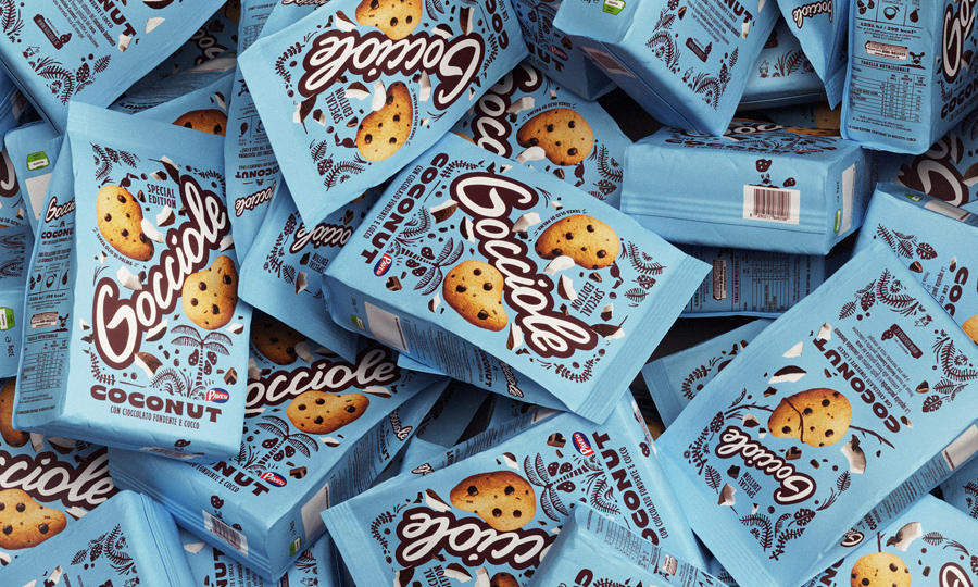
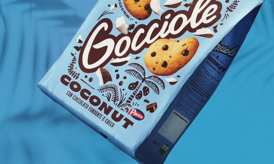
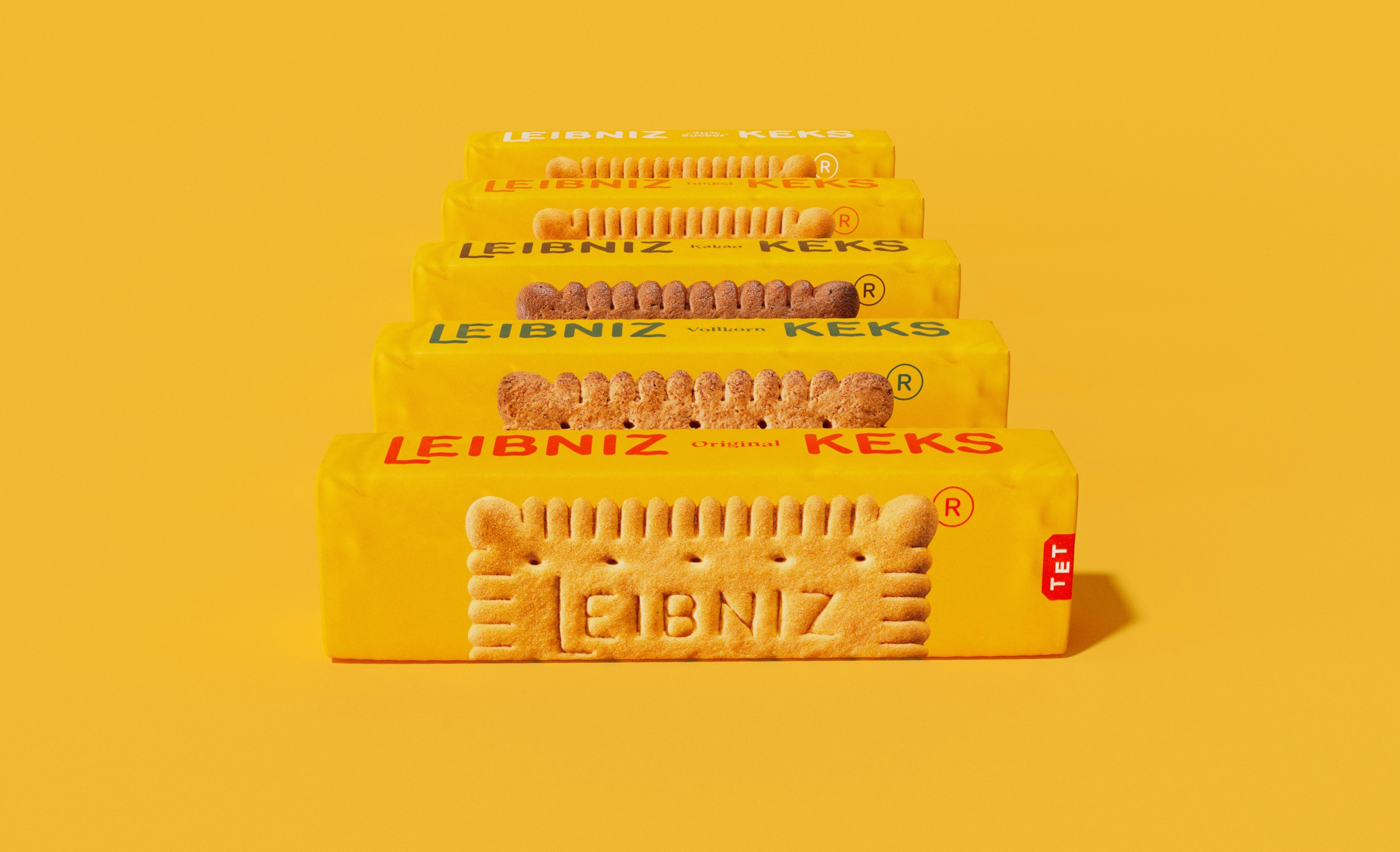
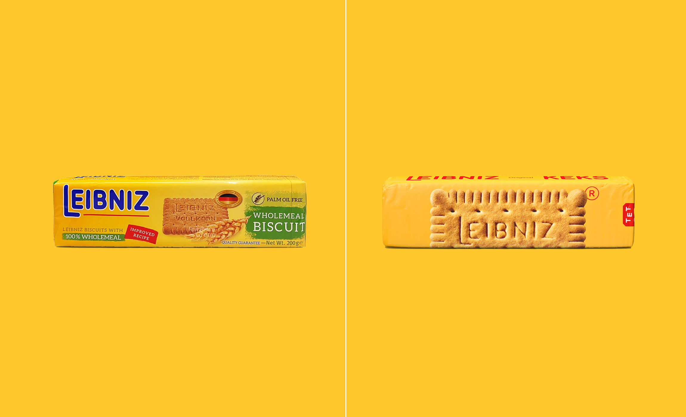
The original Leibniz biscuit has a simple and distinctive design, fifty-two “teeth” frame the rectangular field on which “LEIBNIZ BUTTERKEKS” is imprinted in capital letters. This was Hermann Bahlsen’s original 1891 design. The biscuit has been featured in a series of “Monuments of German Design” by the Süddeutsche Zeitung. And this was exactly our starting point, the strength of a shape that manages to embody all the necessary information on the product by itself, the ultime hero product. Therefore we kept the recognizable Leibniz yellow by improving the sunflower tone of color and explode the biscuit on the front, the one and only keks. Regarding the new Brand logo, we decided to keep the original rounded style and “baked” it exactly the way biscuits are, therefore the logo has smooth inktrap that remind of the dough when it swells; from the logo to an entire customized type, the Butterkeks Display. On the side we use the whole system, huge Logo and range that embrace the flavor, a caring gesture. A natural color palette remind us of the goodness of the products.
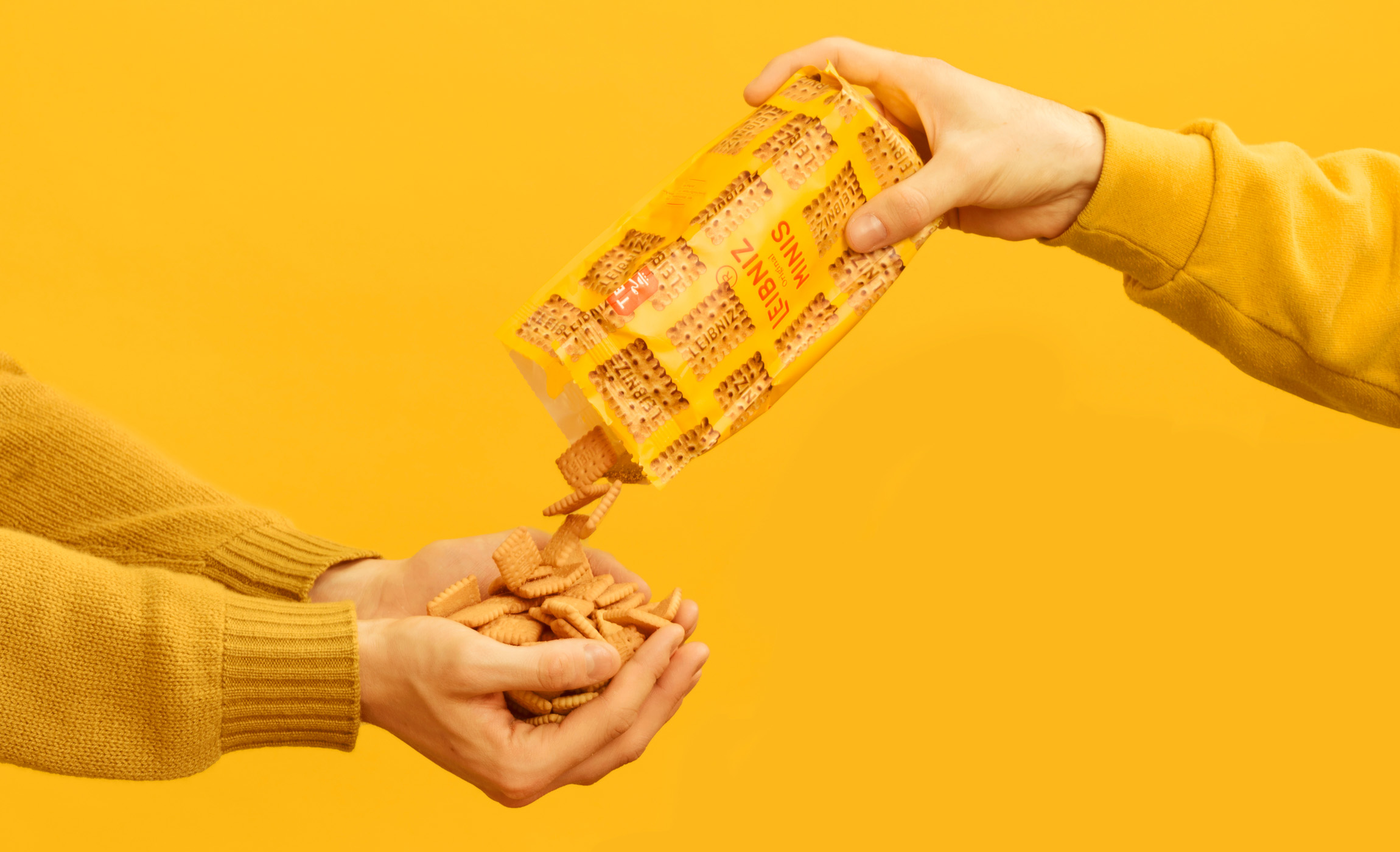
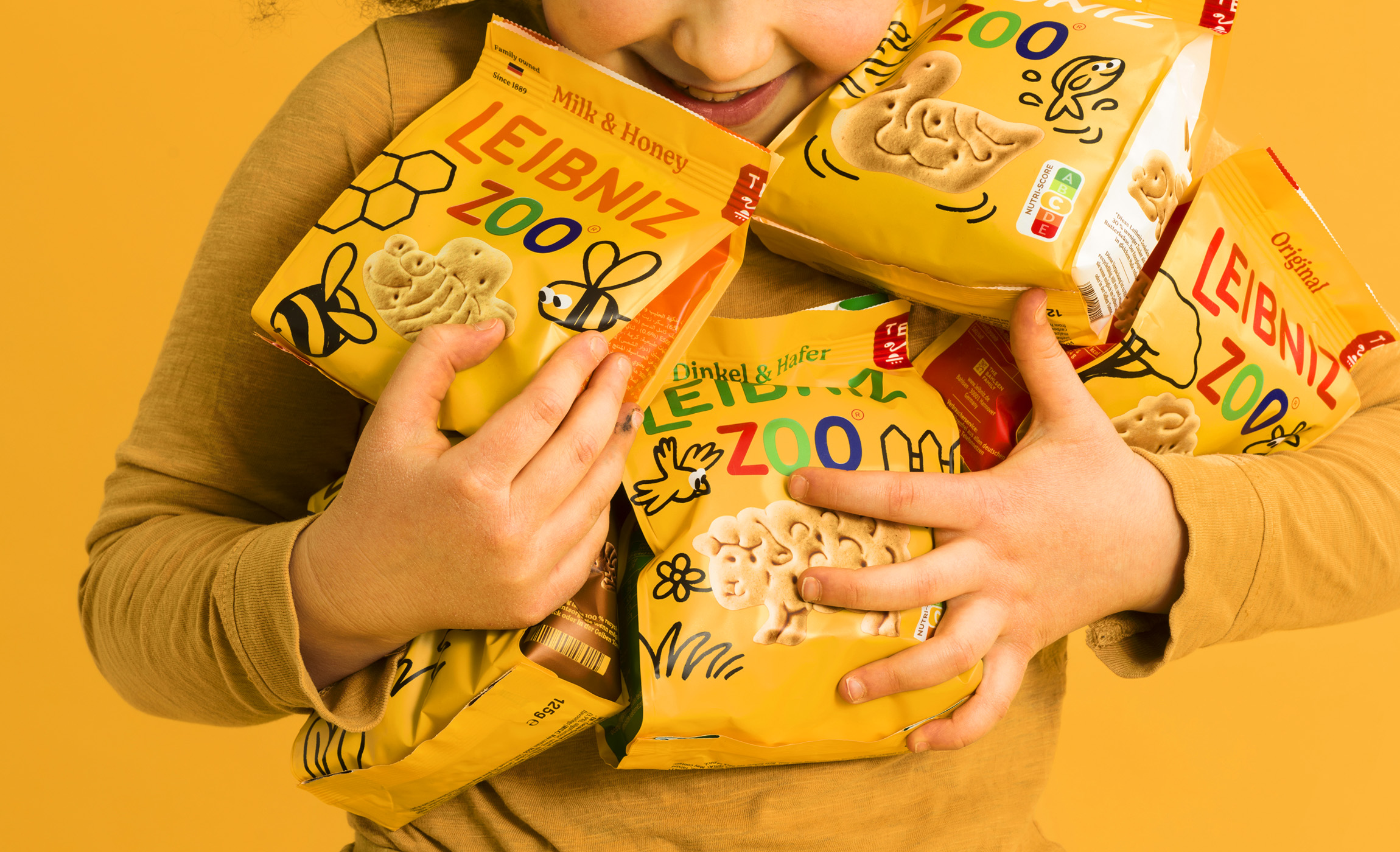
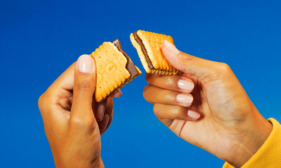
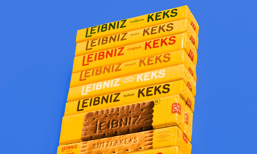
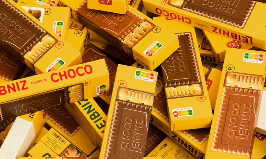
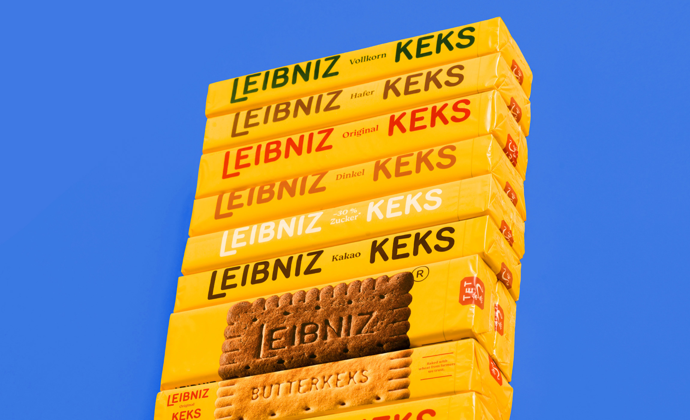
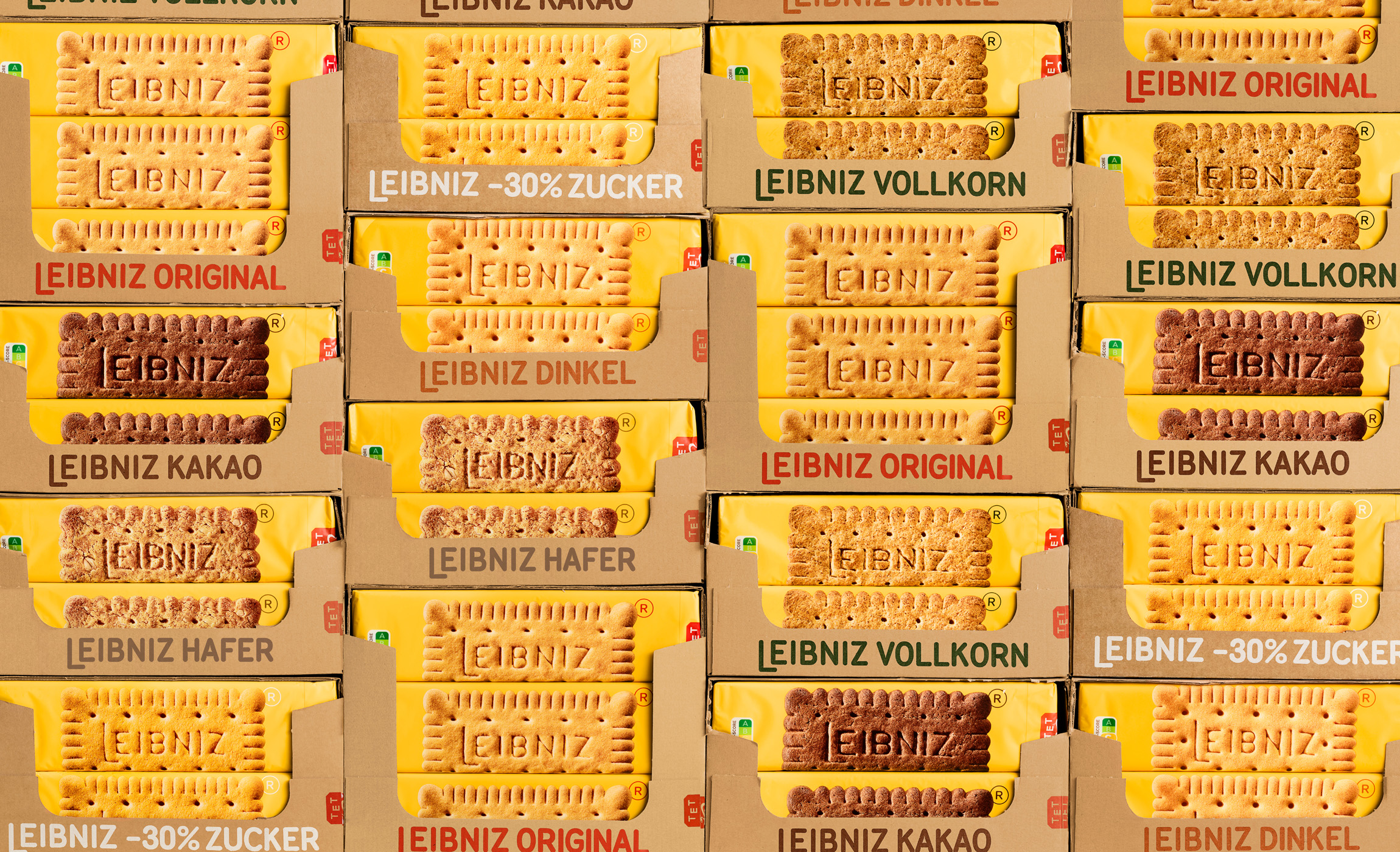
We have build an architecture made of 6 different ranges where the biscuits are the ultimate hero, able to carry all the essential informations. Macro photography has been taken for this project in order to massively enhance every single detail of the biscuits texture and make the flavor recognizable at first glance. The distinctive Leibniz yellow increases the wall impact on shelf. The last touch thought to represent perfectly the new natural direction of the Brand are the outer case, they are all in kraft paper and the name printed on it according to the different range/flavor with the corresponding color.
Biscuits photo: Mierswa-Kluska
Case pics: The Food Pirate
Video Motion: Giorgio Schwarz


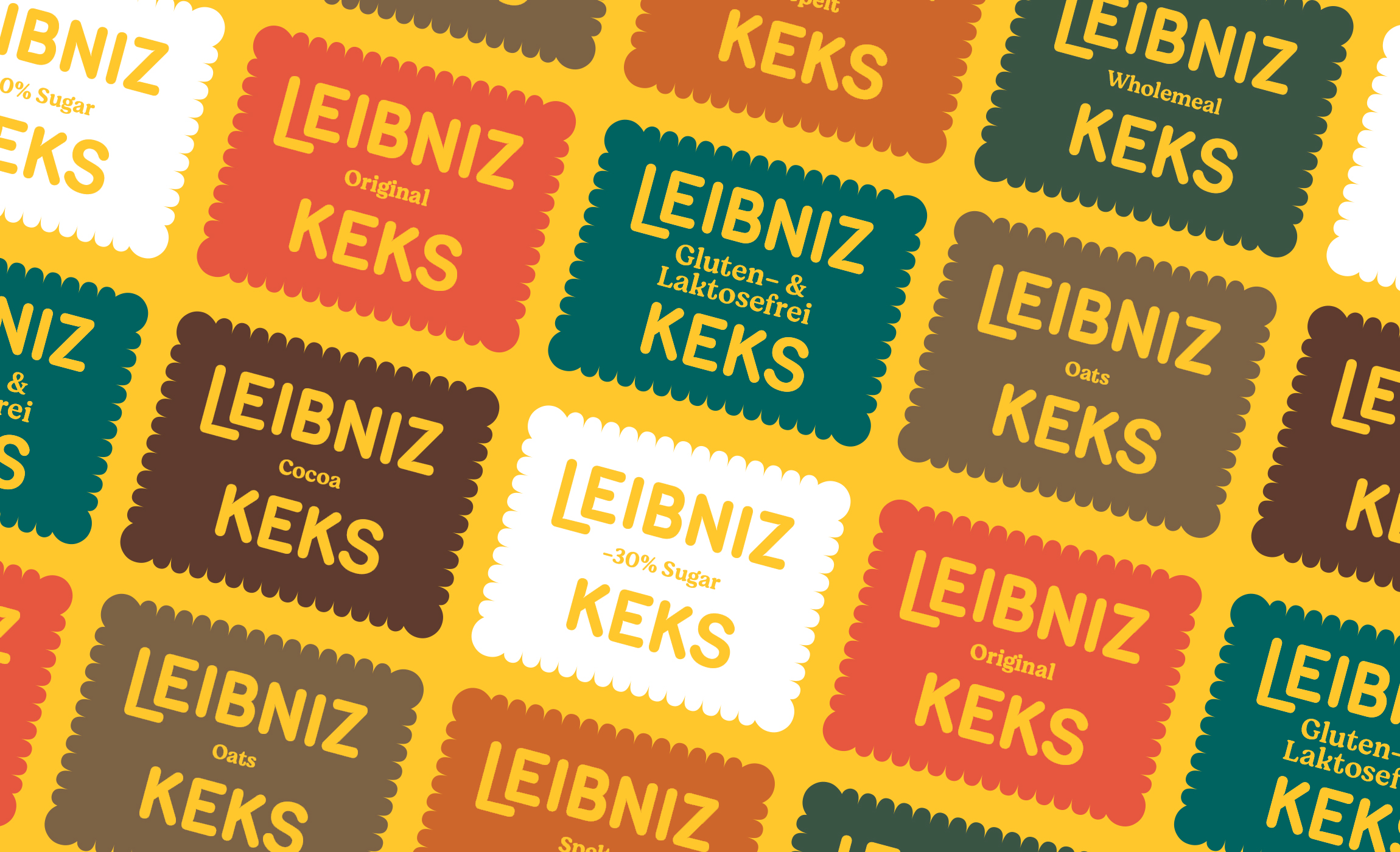
/ We have build an architecture made of 6 different ranges where the biscuits are the ultimate hero, able to carry all the essential informations.
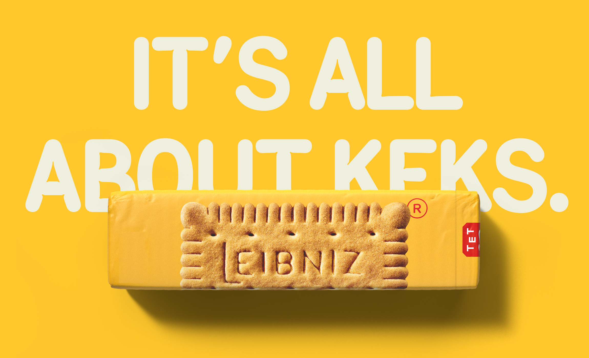
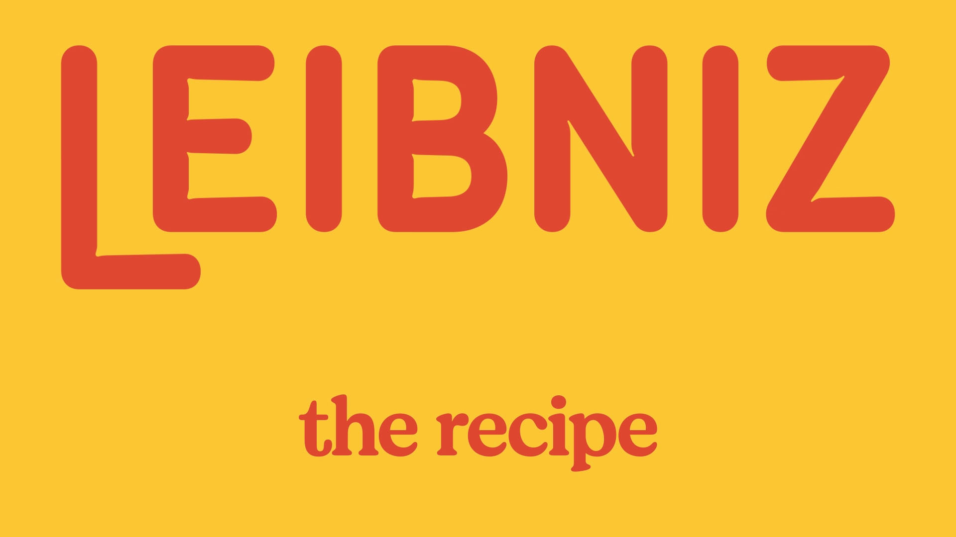
/ We decided to keep the original Logo rounded style and “baked” it exactly the way biscuits are, therefore the logo has smooth inktrap that remind of the dough when it swells.