/
All
/
Identity
/
Packaging
/
Digital
Pick UP!
/identity /packaging
CLITA
/identity /packaging
Leibniz Design Relaunch
/identity /packaging
Sammontana “I Classici”
/packaging
Roncadin Extra Voglia
/packaging
Bahlsen Seasonal 2021
/packaging
Ginori LCDC Collection
/identity /packaging
Cantina Puiatti
/identity /packaging
The Perfect Pop
/identity /packaging
Bahlsen Global Relaunch
/identity /packaging
Why Run
/identity
C’è di Buono in Italia
/packaging
Gocciole Coconut
/packaging
Voiello “La Scaramantica” 2020
/packaging
Famiglia Crispino
/identity /packaging
Sammontana Gruvi
/identity /packaging
Rana Duetto
/packaging
Sammontana UAU! Bars
/packaging
Sella&Mosca Bitter
/packaging
Sir Winston Attivatè
/packaging
Voiello “La Scaramantica”
/packaging
Bellavista Alma Non Dosato
/packaging
Sammontana UAU!
/identity /packaging
Sammontana cakes
/packaging
Pedon
/identity /packaging
Mutti Limited Edition
/packaging
Calligaris
/identity
CODE by Calligaris
/identity /packaging
Fast & Fresco
/identity /packaging /digital

Auge Design Srl

Address /
Via Gino Capponi, 26
50121 Firenze – Italy

Contact /
+39 0550209450
info@auge-design.com

Follow /
LinkedIn
Behance
Instagram

  • Profile
  • Contact
  • Shop
Work
  • Work
  • Profile
  • Contact
  • Shop
next
previous
/packaging
Sammontana UAU! Bars

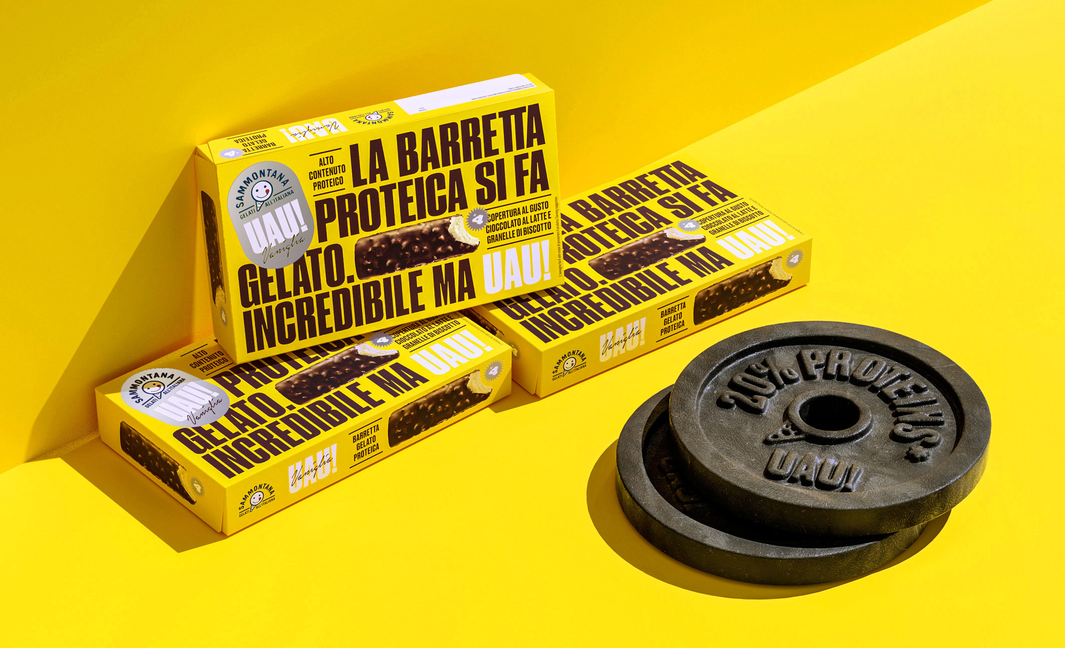
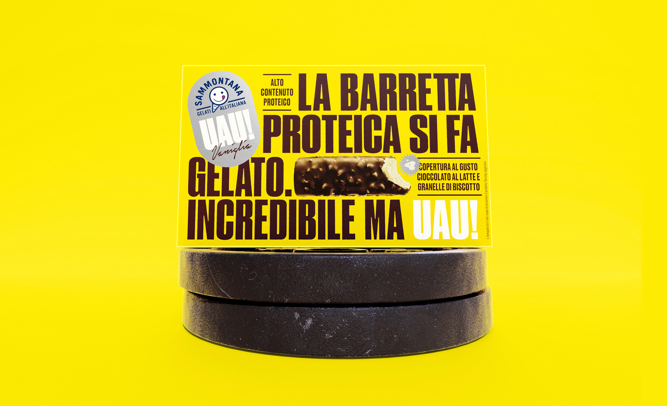
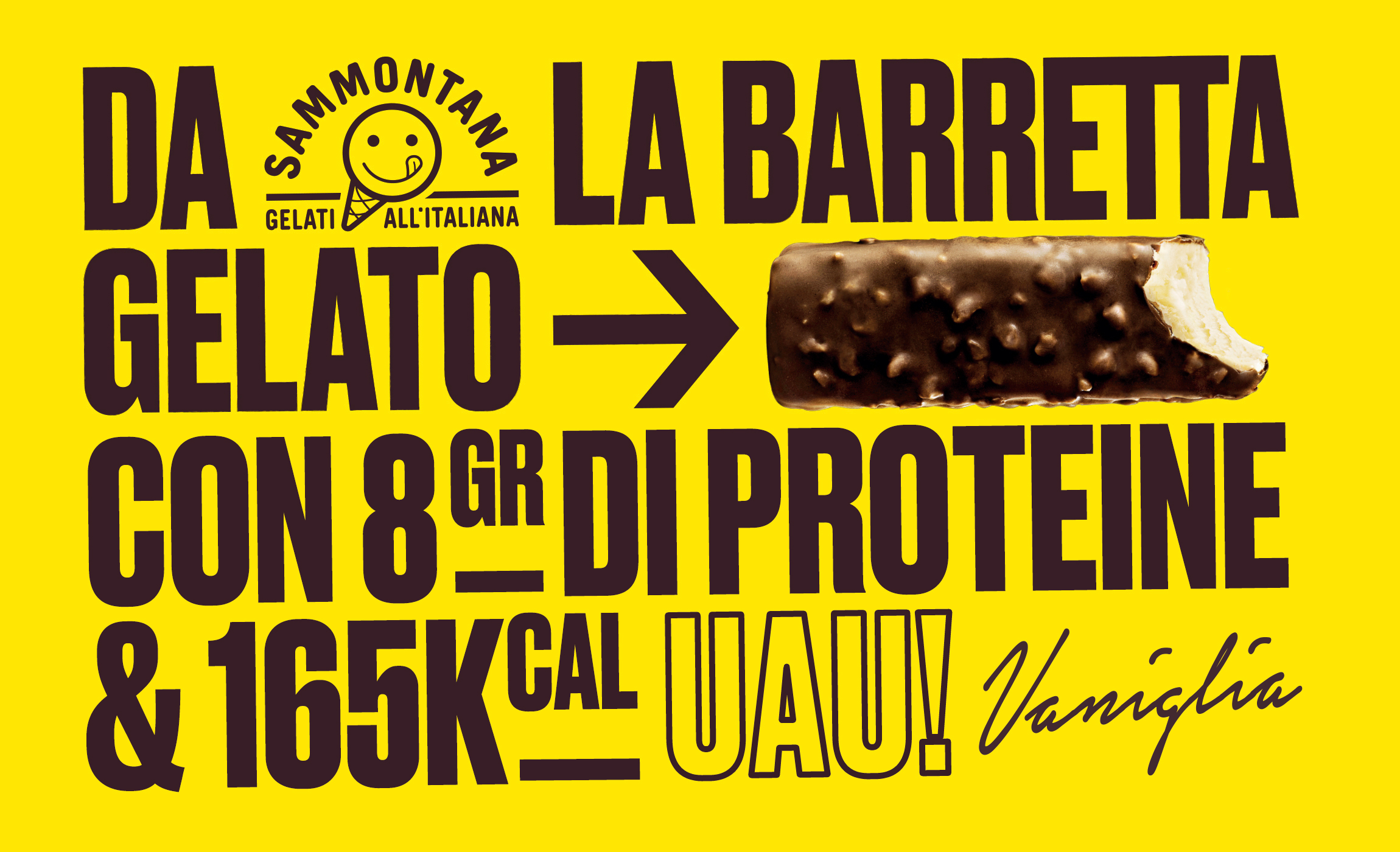
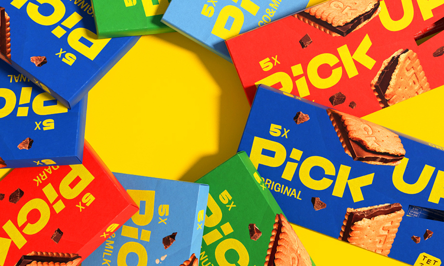
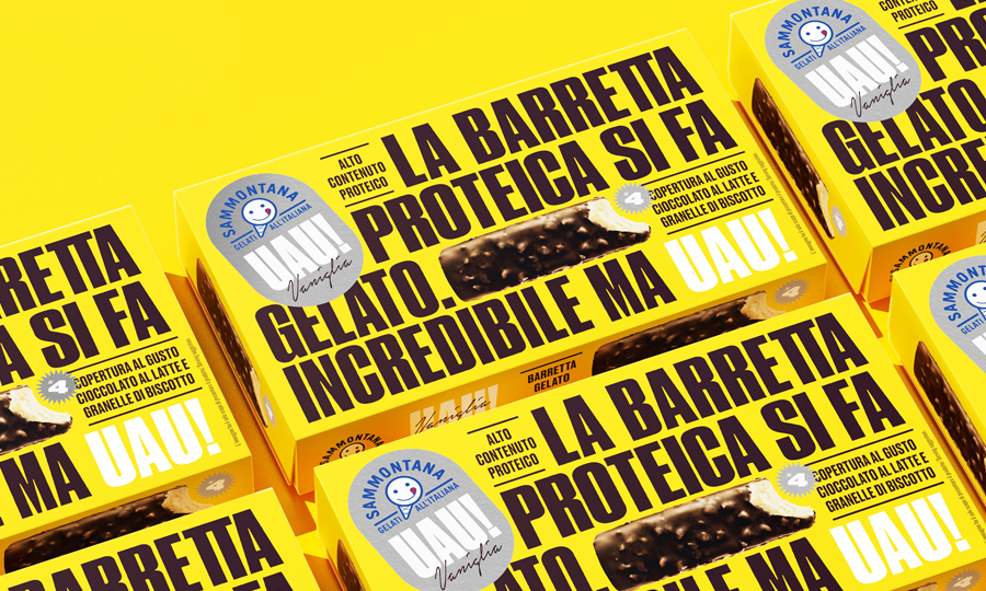
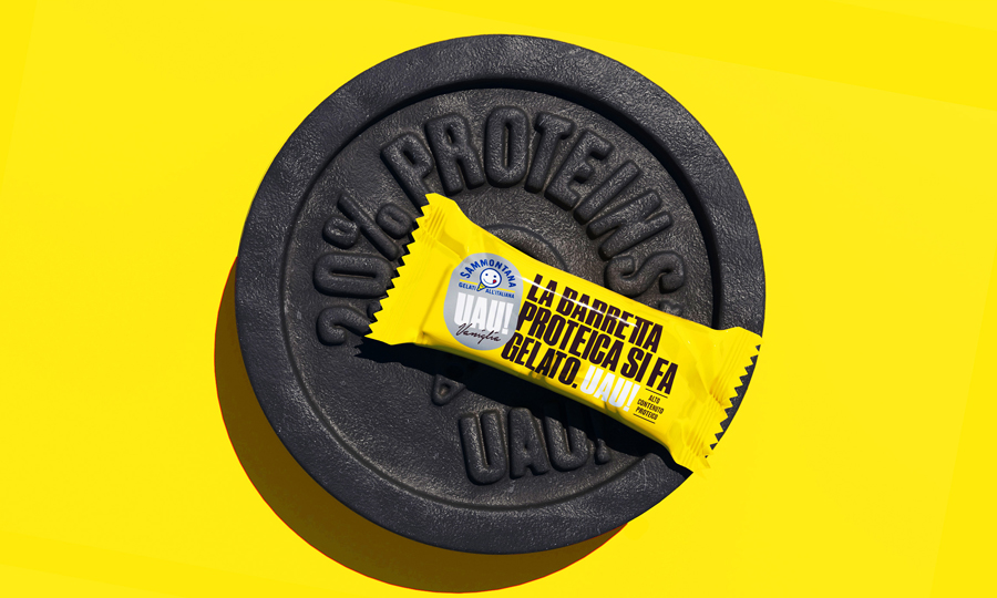
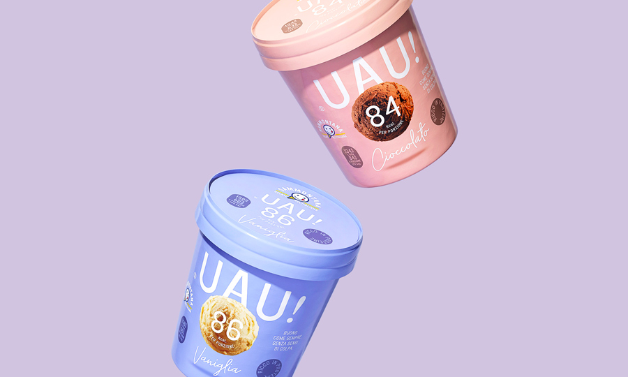
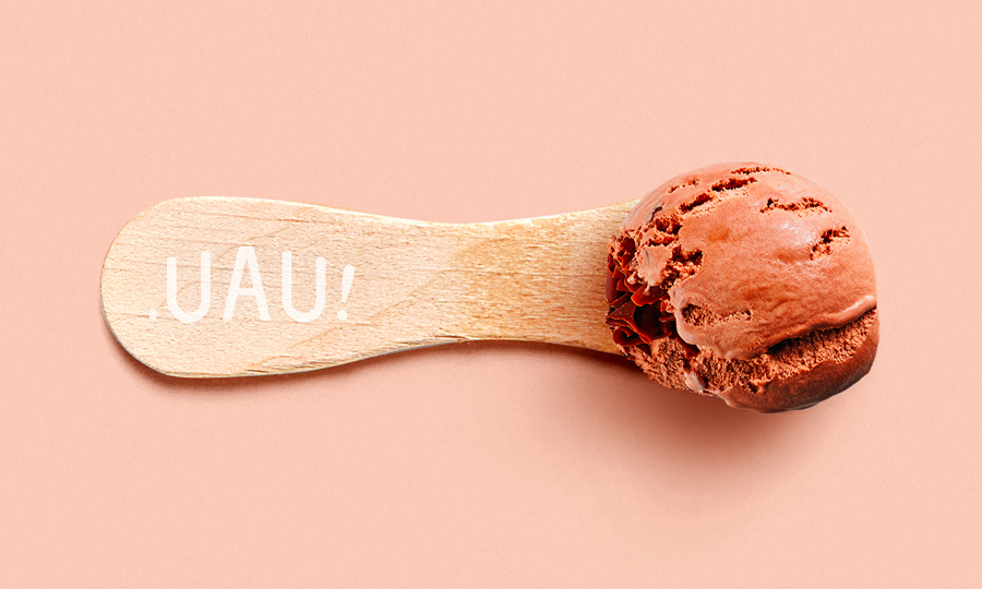
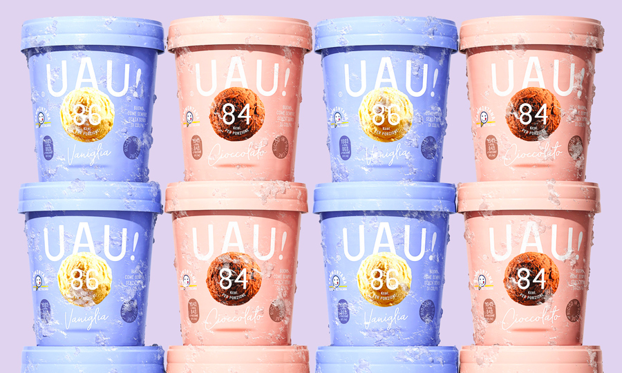
/ The protein bar has now become an ice cream. Say hi to the yummiest gelato bar bodybuilders have ever tasted: Incredible but UAU!

More Info
Client

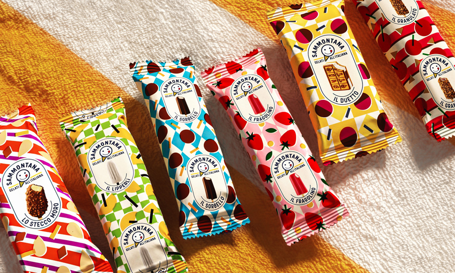
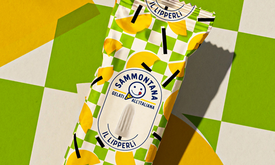
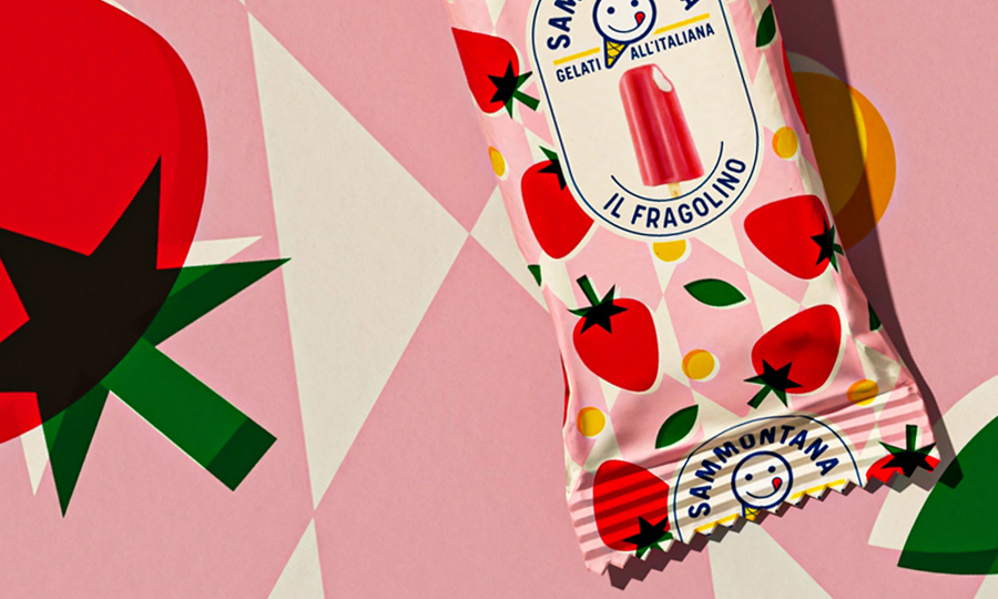
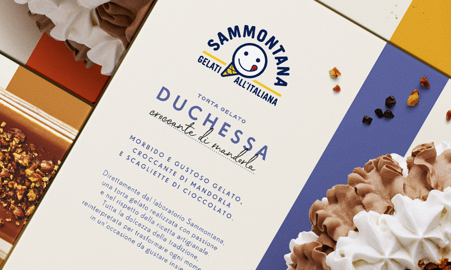
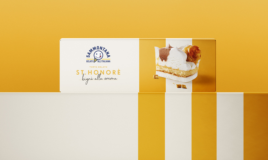
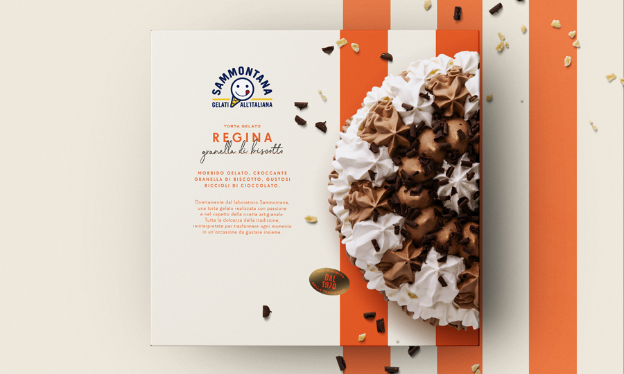
With over 70 years of history in ice cream making, Sammontana is the Italians’ favorite industrial ice cream and frozen goods brand. The Group operates in 5 production sites around the country and counts over 1000 employees. Sammontana indubitably means Italian Summer.

Assignment

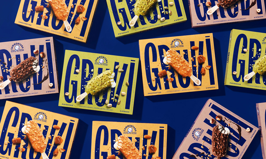
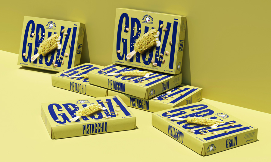
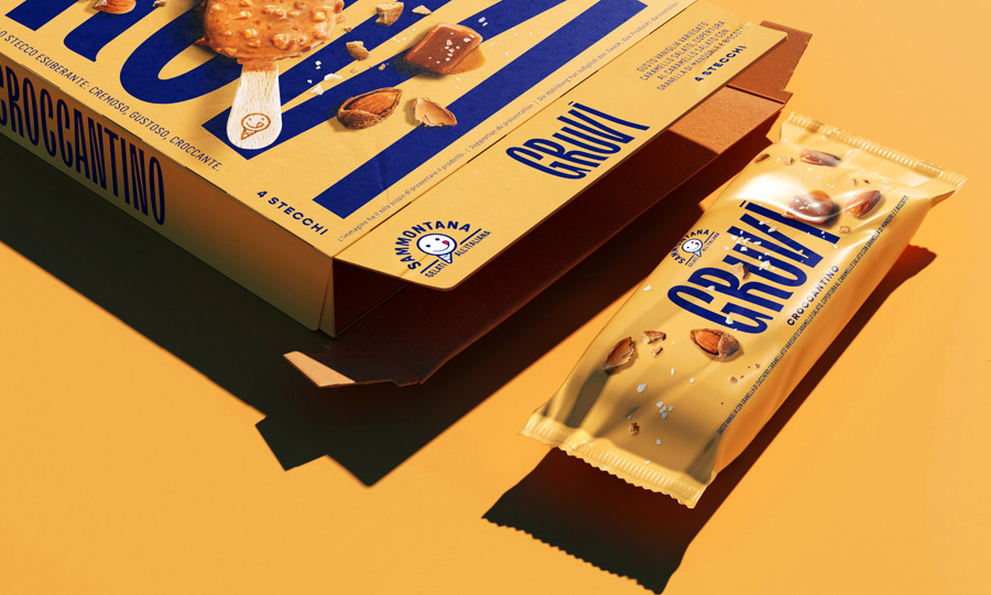
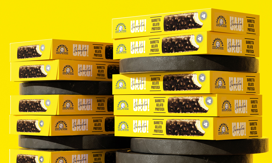
The creation of a new product’s identity in the context of designing the packaging of the new UAU! ice cream proteic bars. This design should be nothing but powerful, energic and sporty.

Solution

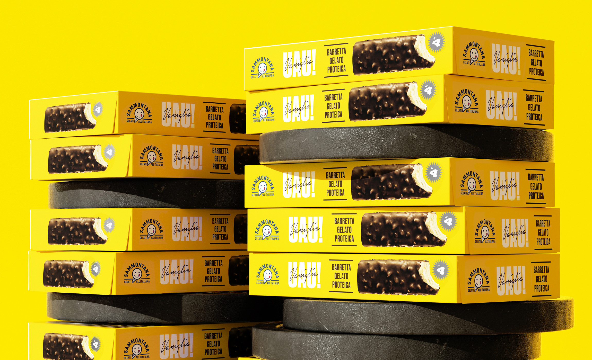
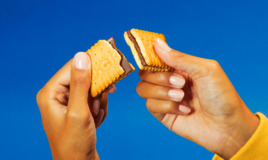
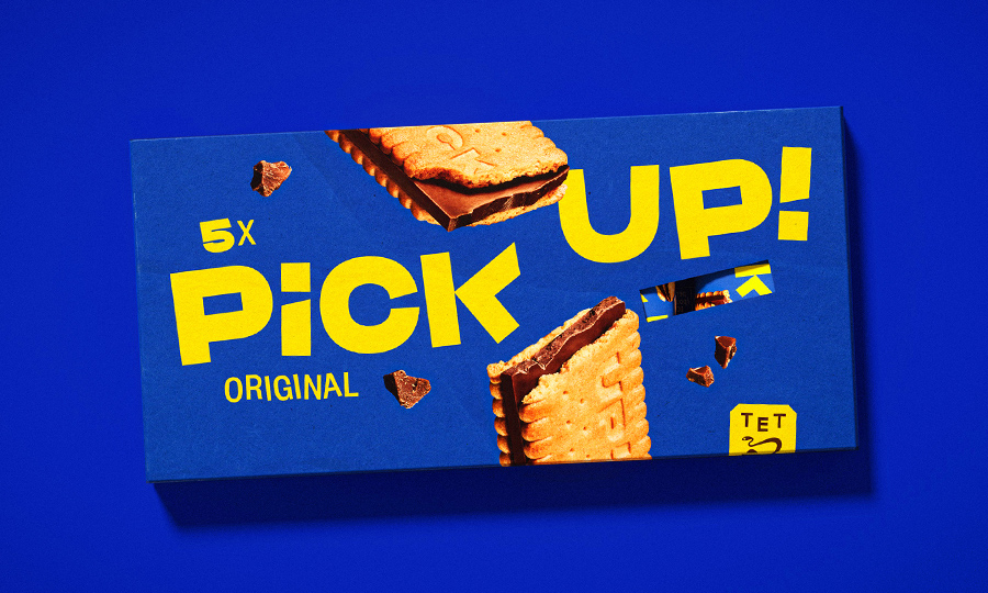
We gave birth to a manifesto-like front pack, where the product’s peculiarities were strongly stated through a thick typography, a graphical product image presence and a strong background color.

Process

Creation of naming, logo and brand identity of the product, following art direction of the photographic shooting of the still. Definition of a color palette and a typographic ecosystem.

Year / 2020
Share /
Facebook
Pinterest
Twitter
1/2
/ Related case
Sammontana UAU!
/identity /packaging
Sammontana cakes
/packaging
Sir Winston Attivatè
/packaging

Auge Design Srl

Address /
Via Gino Capponi, 26
50121 Firenze – Italy

Contact /
+39 0550209450
info@auge-design.com

Follow /
LinkedIn
Behance
Instagram

Auge Design is proudly partner of Auge Headquarter