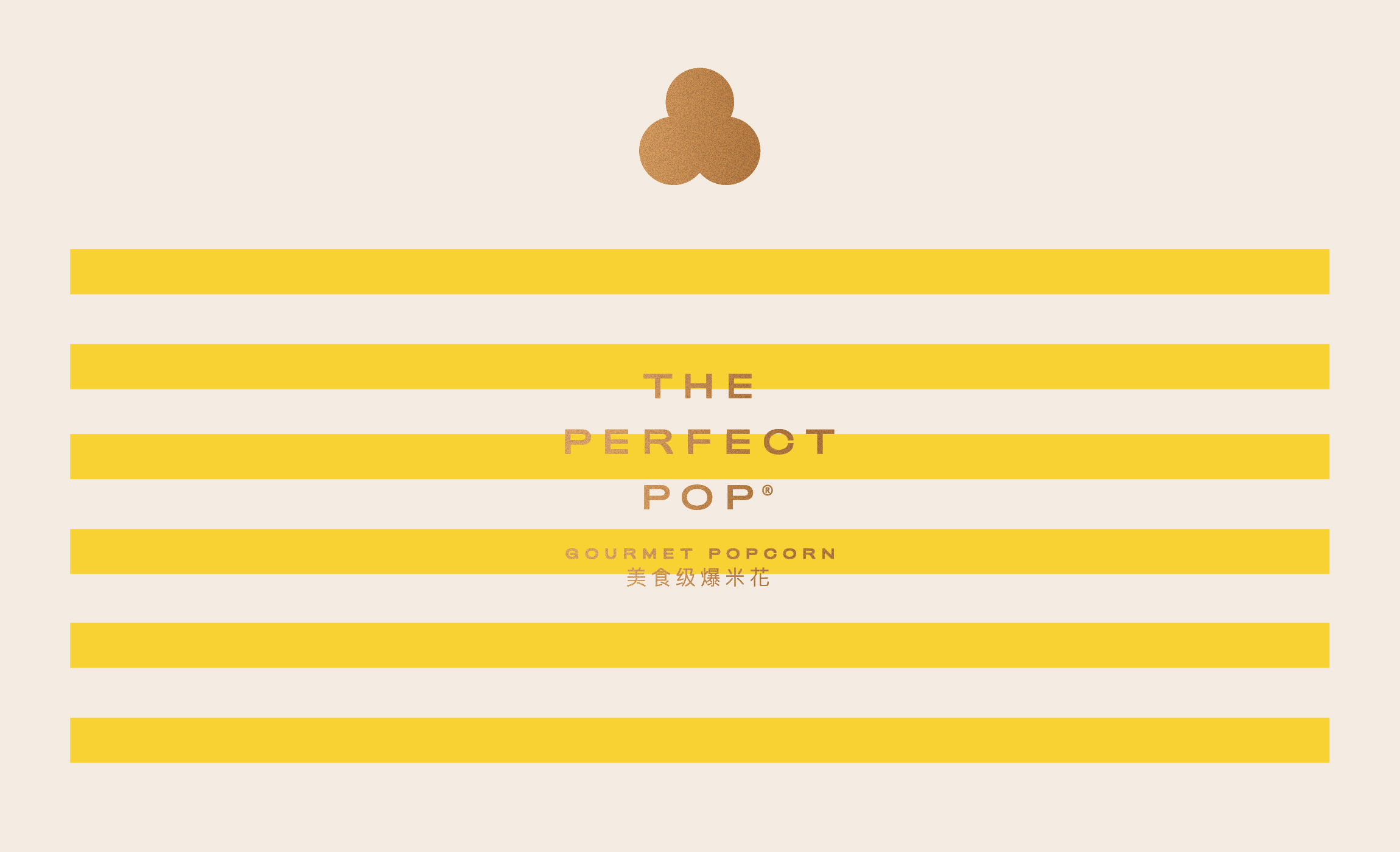


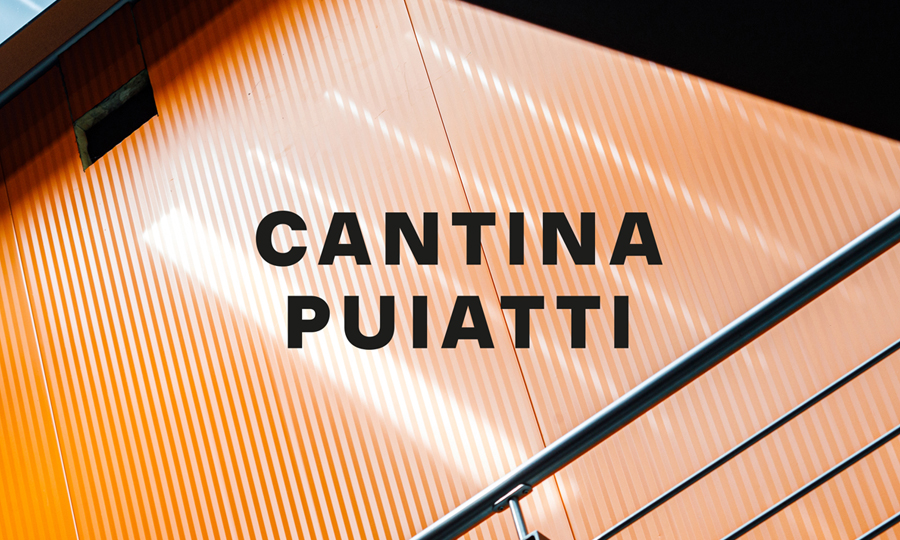
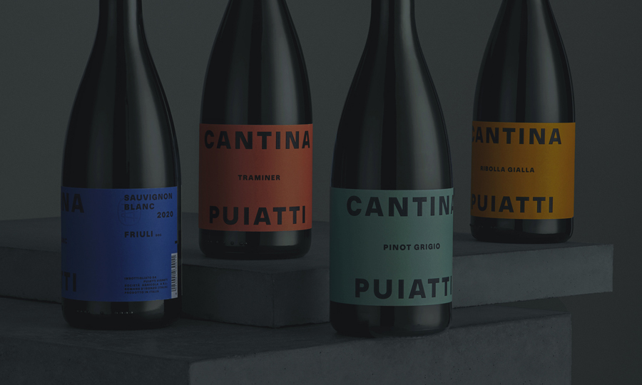

/ Our recipe for a balanced visual identity made of popness, preciousness, poshness and of course flavour. Meet The Perfect Pop’s new look.
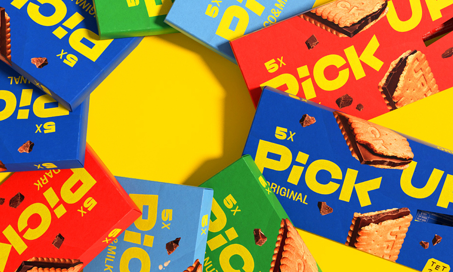
The Perfect Pop is a gourmet popcorn manufacturer based in China but also distributing abroad, like in the US and Europe. Their core business relies on popcorn, with a 20+ flavours gourmet popcorn offer. In few years the brand managed to grow enough to open multiple flagship stores across China, in the provinces of Hubei, Guangdong and others.
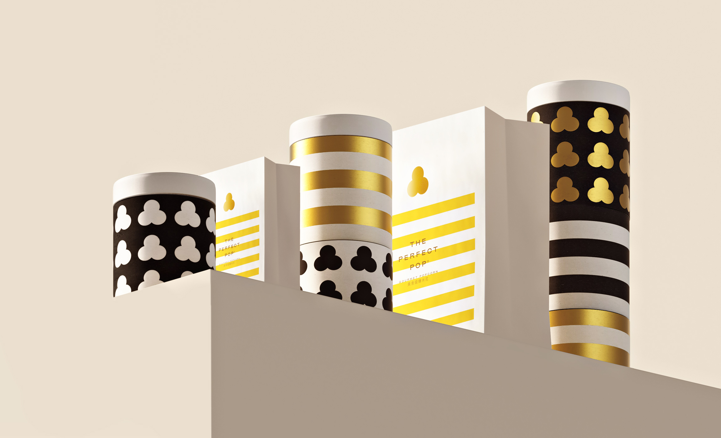
The brand asked us to restyle their logo and create a new visual system for their retail packagings. The requested deliverables, in addition to the identity definition, included the development of the classic take-away popcorn bags, as well as a brand new gift-box format packaging.
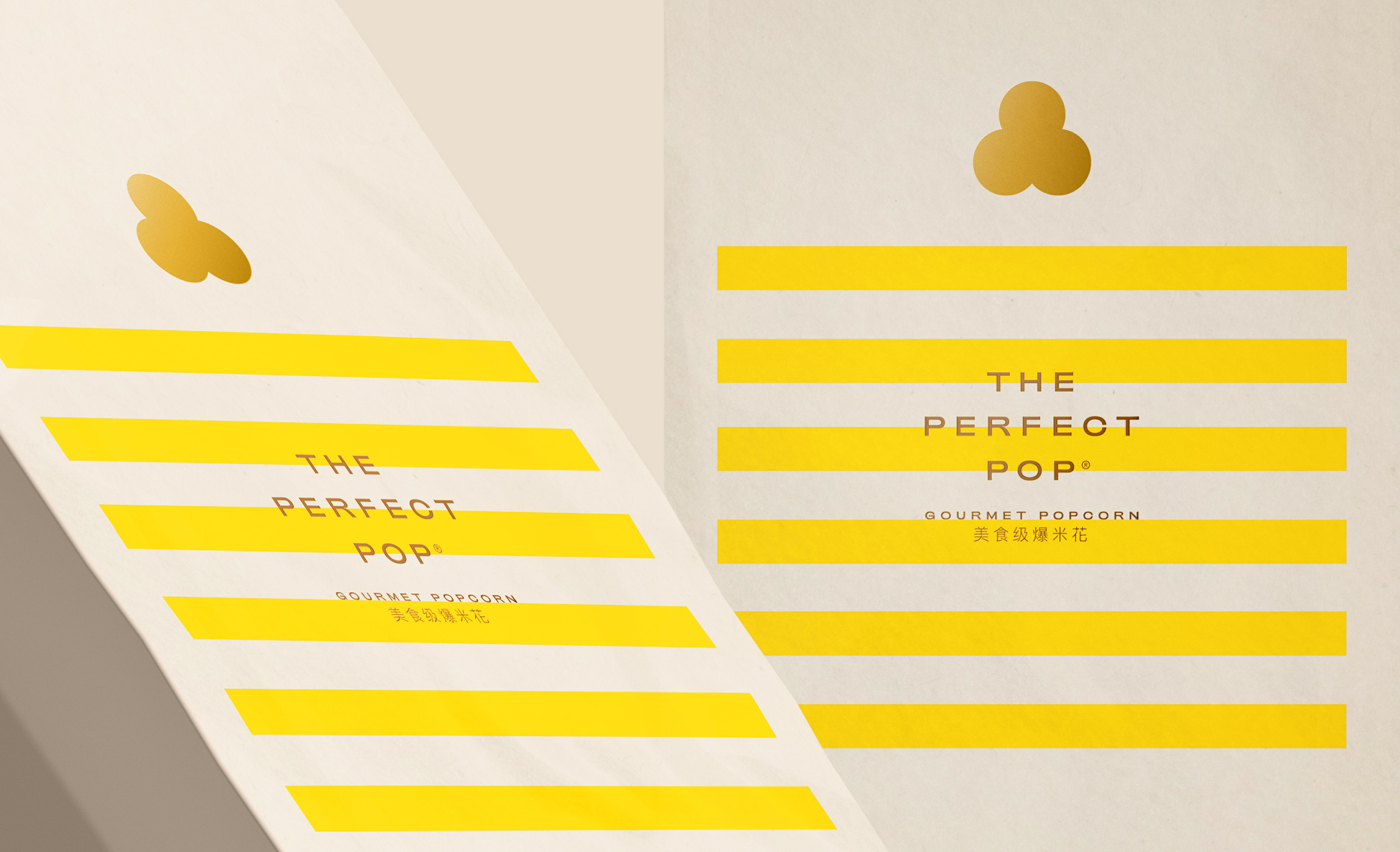
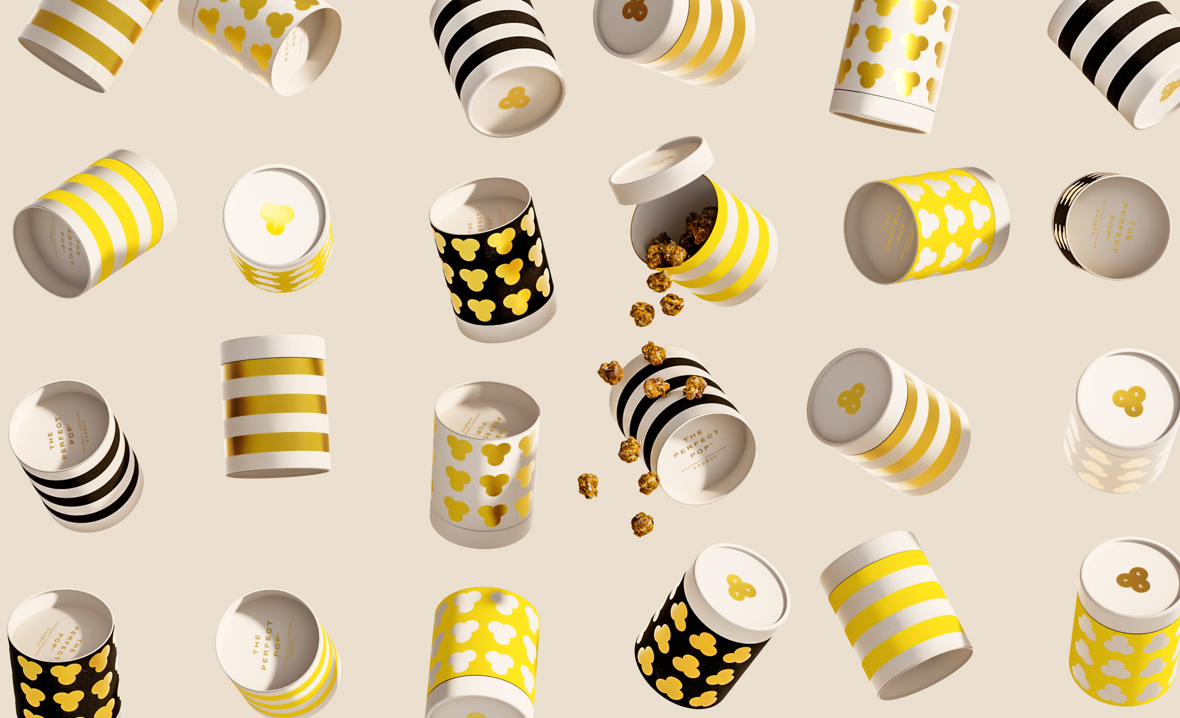
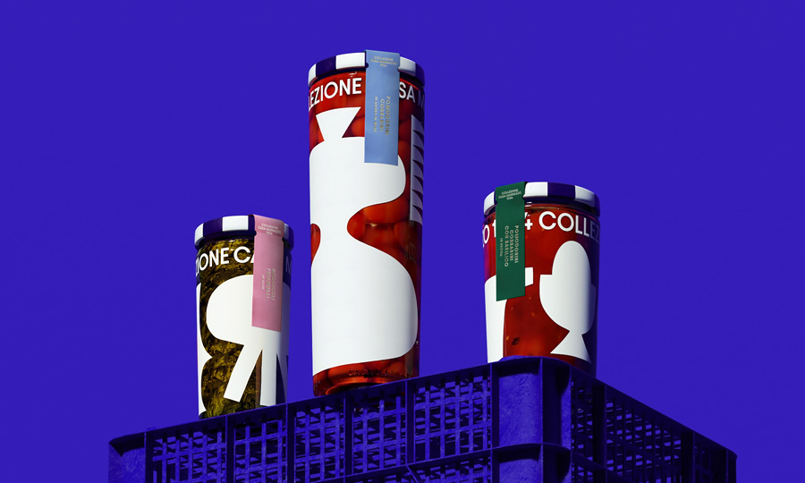
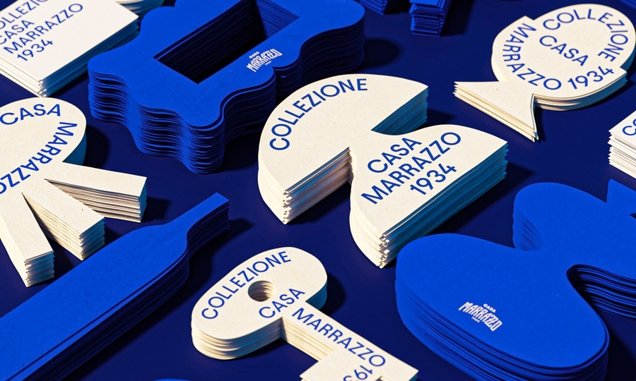
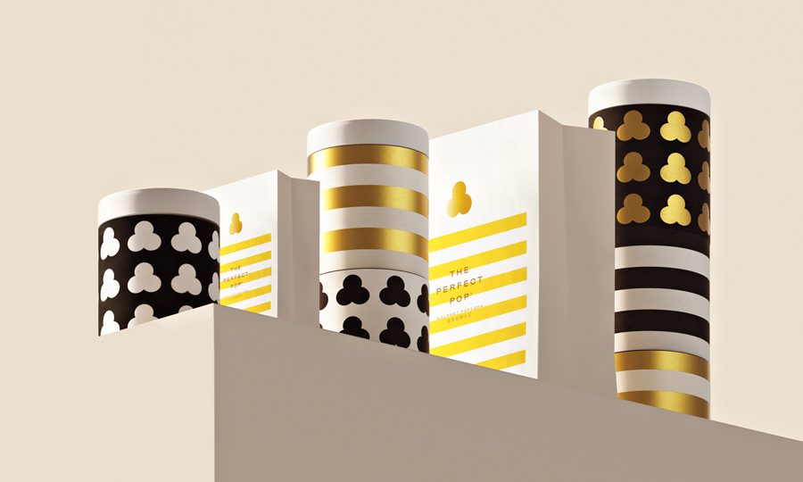
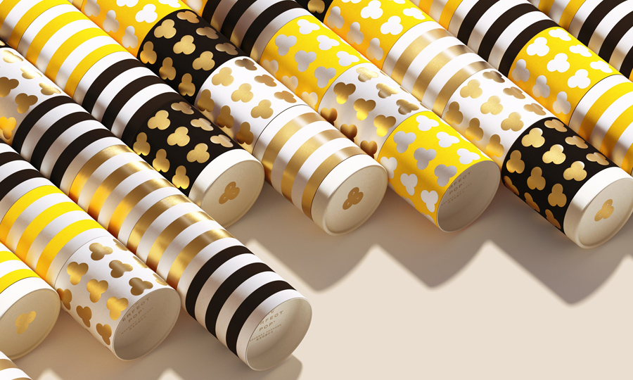
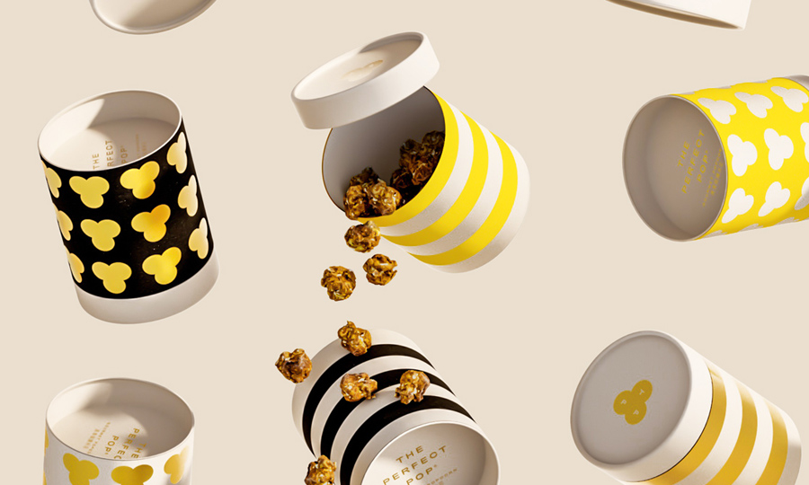
After defining a new logo, a mark and a typographic ecosystem, we developed a series of pattern, adopting both the new pictogram and another visual asset – stripes. The retail popcorn bags were customized using these visual assets. We were also asked to design a brand new packaging support for a special gift packaging. We came up with a multi-subject, modular, tube packaging. What is special about this pack is that as many tubes as wanted can be placed one on another, thanks to a fitting system and each module’s internal base. A lid closes then the last one of the pile. What the customer walks out of the store with will be a funny tube-shaped tower of single popcorn packagings.
Definition of visual identity, from logo to mark, typographic ecosistem, color palette. Designing the graphical customization of the popcorn bags as well as defining the industrial design and the customization of the gift box tubes.