/
All
/
Identity
/
Packaging
/
Digital
Pick UP!
/identity /packaging
CLITA
/identity /packaging
Leibniz Design Relaunch
/identity /packaging
Sammontana “I Classici”
/packaging
Roncadin Extra Voglia
/packaging
Bahlsen Seasonal 2021
/packaging
Ginori LCDC Collection
/identity /packaging
Cantina Puiatti
/identity /packaging
The Perfect Pop
/identity /packaging
Bahlsen Global Relaunch
/identity /packaging
Why Run
/identity
C’è di Buono in Italia
/packaging
Gocciole Coconut
/packaging
Voiello “La Scaramantica” 2020
/packaging
Famiglia Crispino
/identity /packaging
Sammontana Gruvi
/identity /packaging
Rana Duetto
/packaging
Sammontana UAU! Bars
/packaging
Sella&Mosca Bitter
/packaging
Sir Winston Attivatè
/packaging
Voiello “La Scaramantica”
/packaging
Bellavista Alma Non Dosato
/packaging
Sammontana UAU!
/identity /packaging
Sammontana cakes
/packaging
Pedon
/identity /packaging
Mutti Limited Edition
/packaging
Calligaris
/identity
CODE by Calligaris
/identity /packaging
Fast & Fresco
/identity /packaging /digital

Auge Design Srl

Address /
Via Gino Capponi, 26
50121 Firenze – Italy

Contact /
+39 0550209450
info@auge-design.com

Follow /
LinkedIn
Behance
Instagram

  • Profile
  • Contact
  • Shop
Work
  • Work
  • Profile
  • Contact
  • Shop
next
previous
/packaging
Sammontana “I Classici”

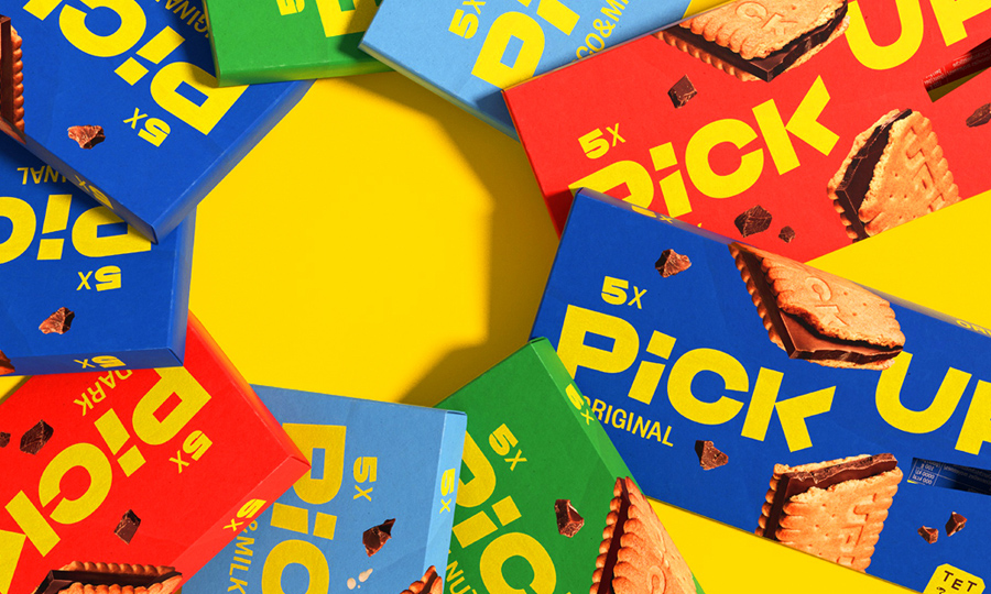
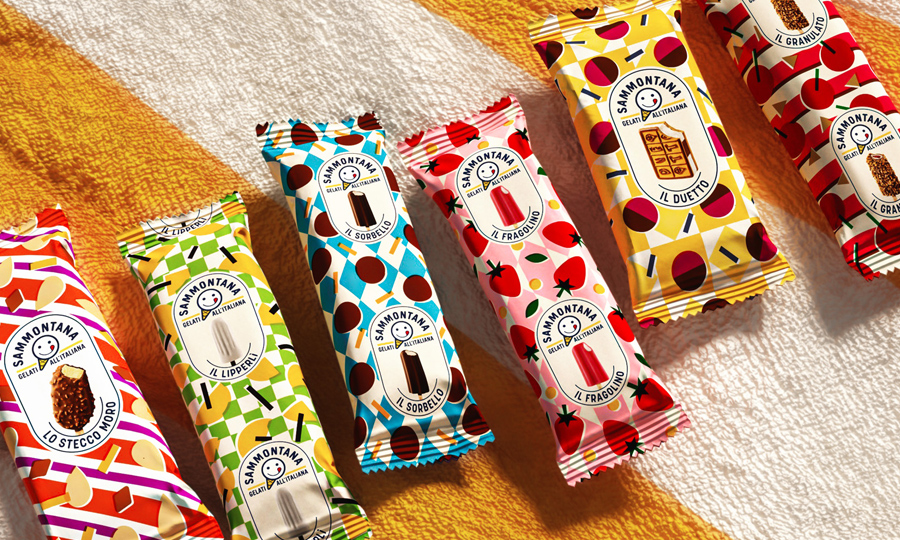
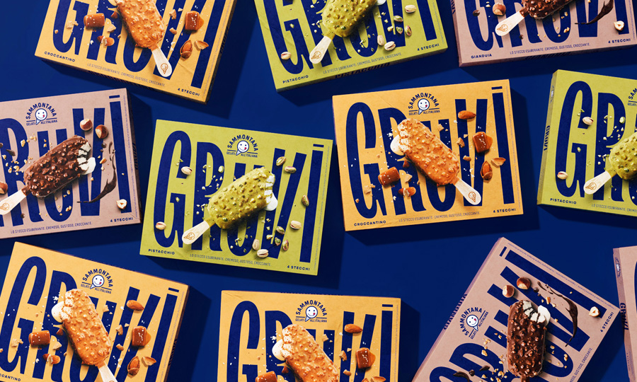
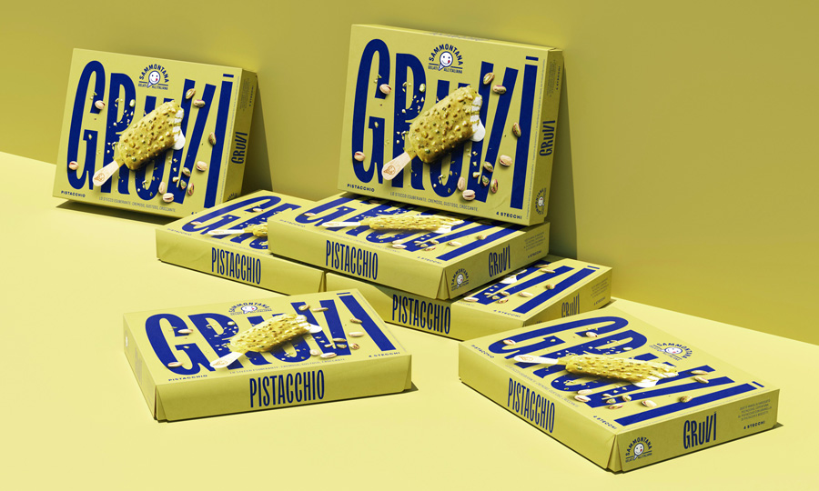
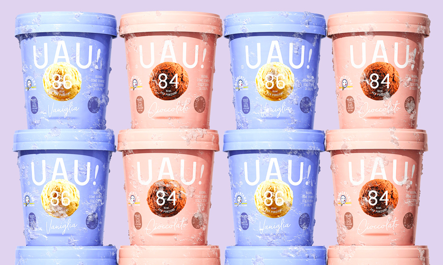
/ Complete restyling of the most iconic ice creams that belong to the summer memory of every Italian. Not old, just classic.

More Info
Client

With over 70 years of history in ice cream making, Sammontana is the Italians’ favorite industrial ice cream and frozen goods brand. The Group operates in 5 production sites around the country and counts over 1000 employees. Sammontana indubitably means Italian Summer.

Assignment

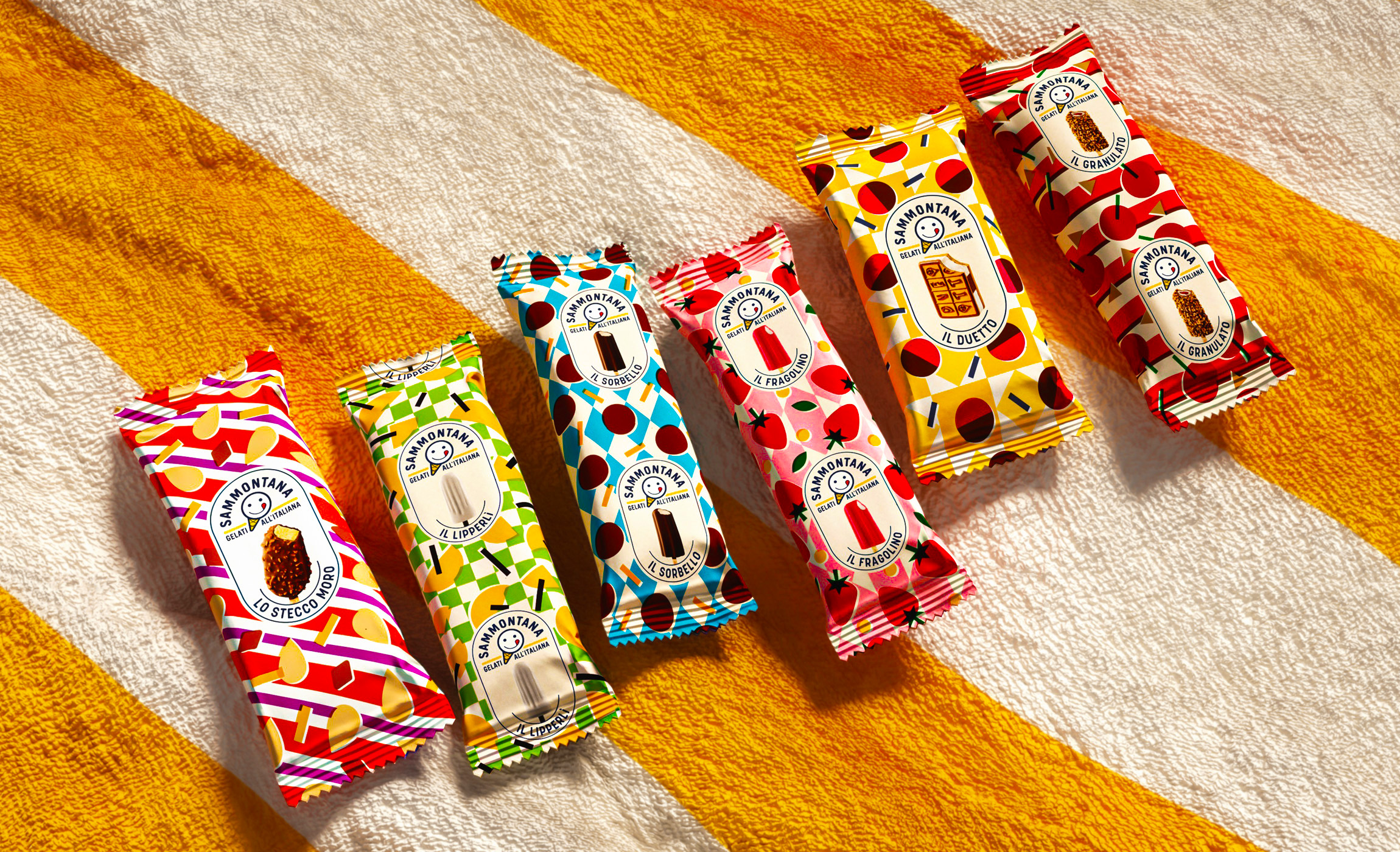
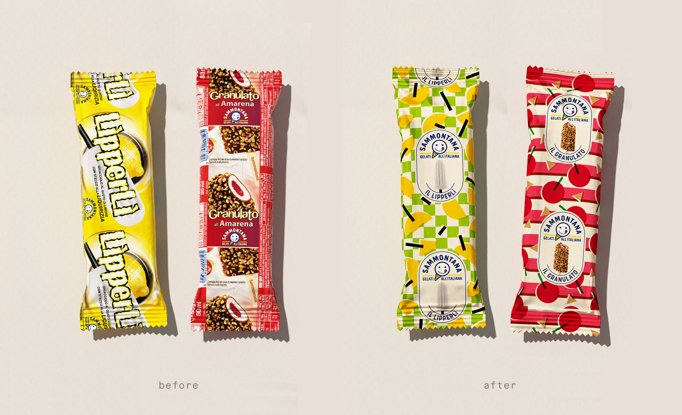
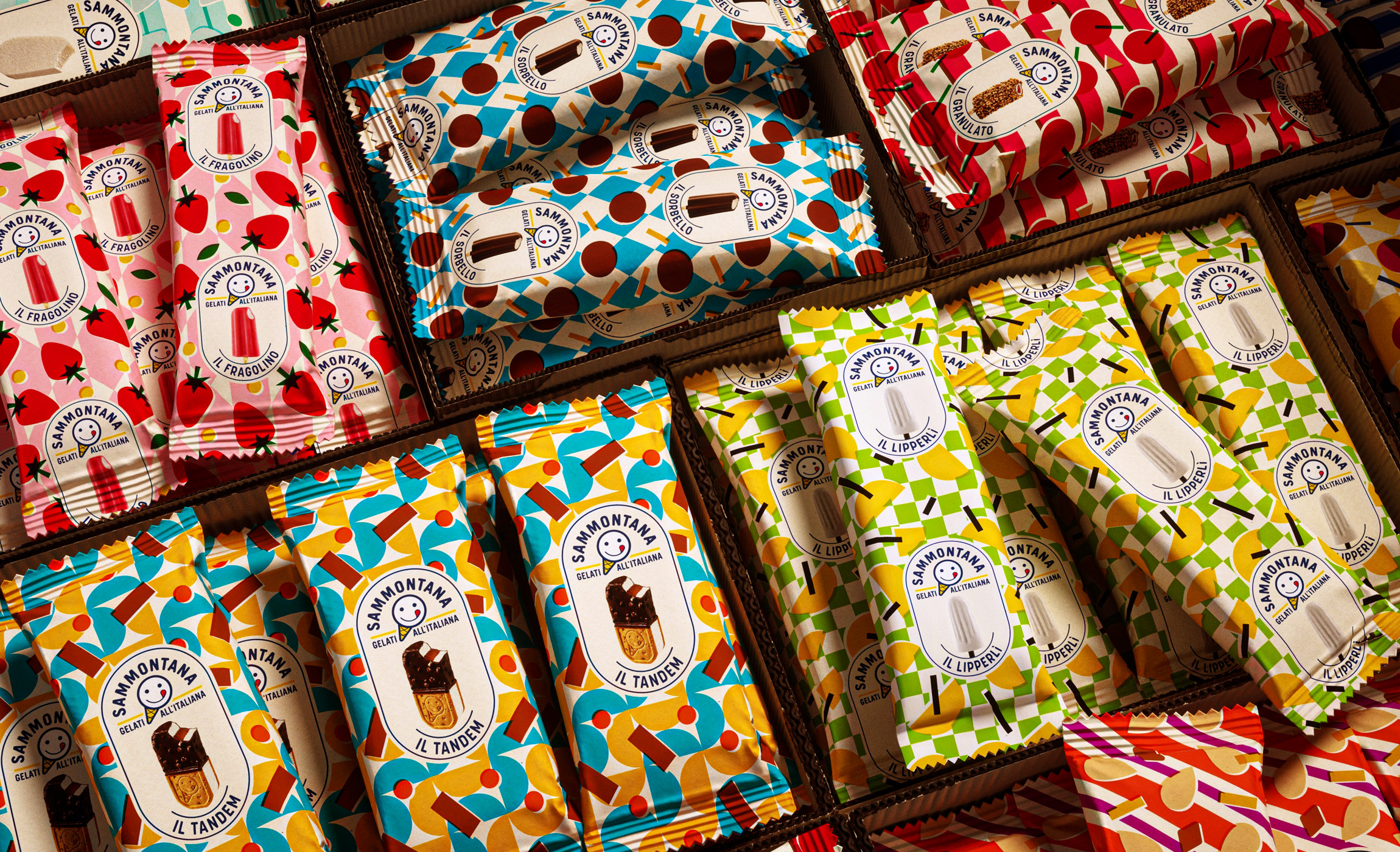
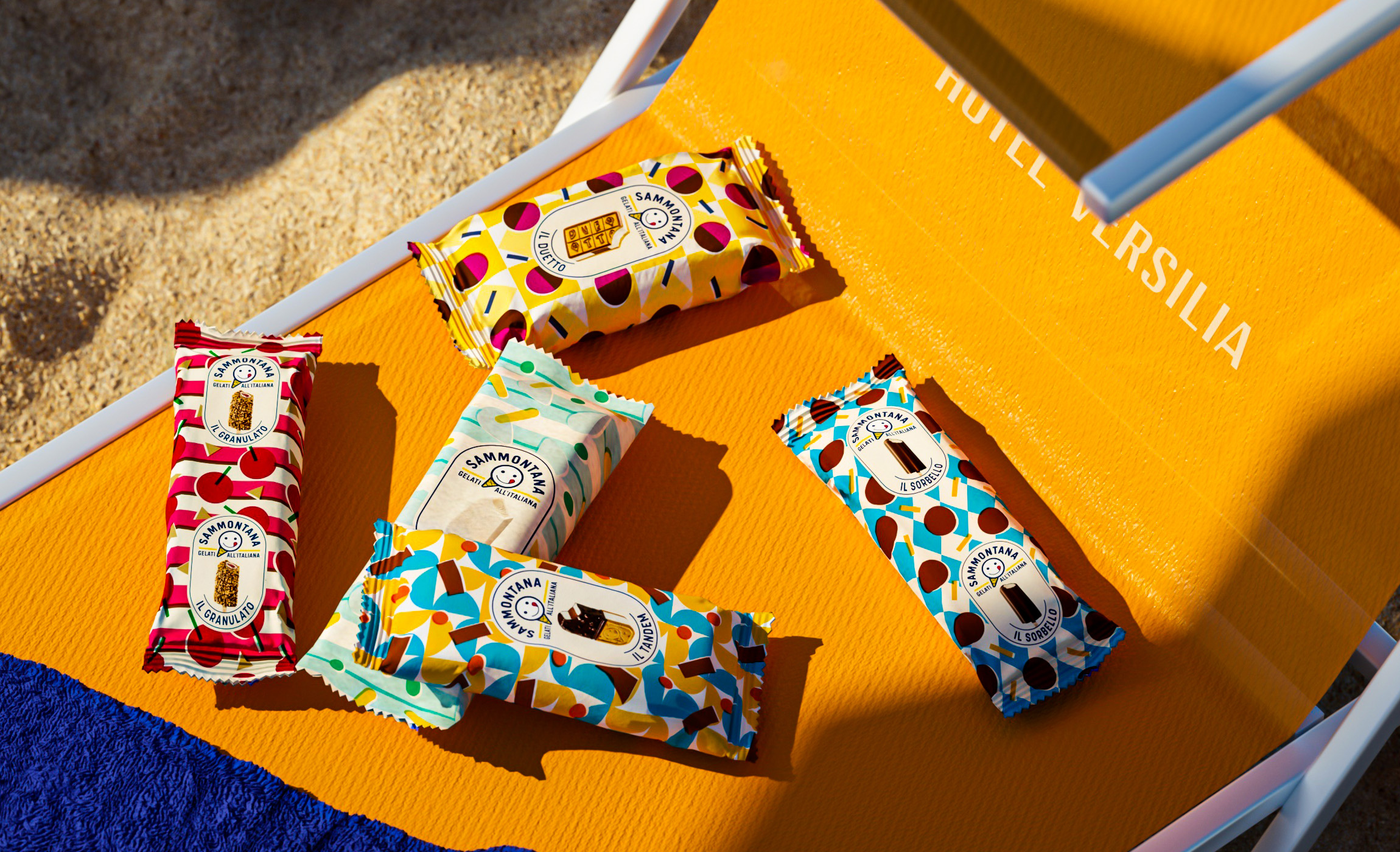
The complete restyle of the most classic ice creams that belong to the summer memory of every Italian. The task was to create a consistent and recognizable product line, but with a different personality for each ice cream.

Solution

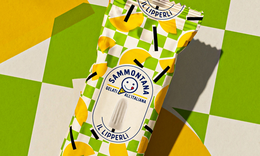
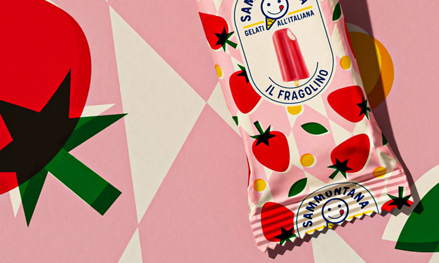
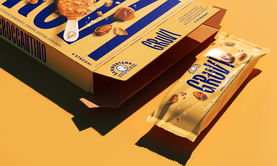
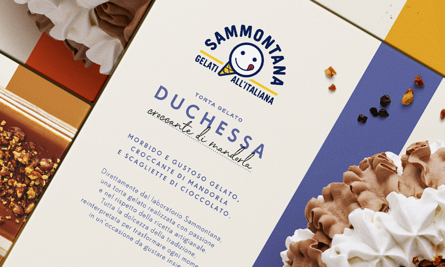
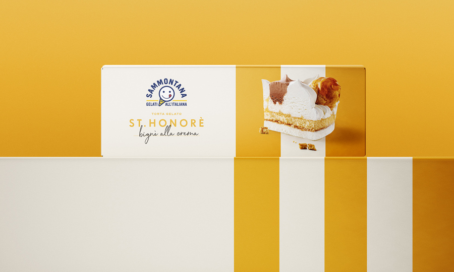
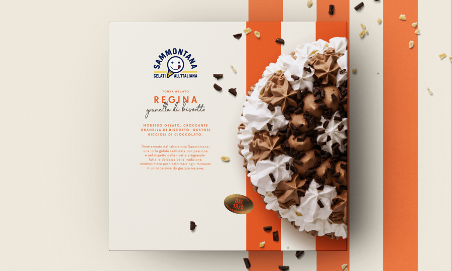
We started by investigating the Sammontana heritage archive, where we find a vast treasure of bold colors and illustrations, we immediately fell in love and wanted to bring back these nostalgic summer vibes. To help create a family feeling we have opted to have the logo, image and names of the ice cream all in the same designated area, that works like a label applied on the pack. Every ice creams has its own pattern, the colors and illustrations used give an idea of the flavor and texture of the product.

Process

We create a format in which the logo and the photo are always positioned in the same position, to make it easier to recognize the product and the brand. Each ice cream has its own unique pattern, the colors and illustrations help the customer to recognize the flavor.

Year / 2022
Share /
Facebook
Pinterest
Twitter
1/3
/ Related case
Sammontana Gruvi
/identity /packaging
Sammontana UAU!
/identity /packaging
Sammontana cakes
/packaging

Auge Design Srl

Address /
Via Gino Capponi, 26
50121 Firenze – Italy

Contact /
+39 0550209450
info@auge-design.com

Follow /
LinkedIn
Behance
Instagram

Auge Design is proudly partner of Auge Headquarter